Back to Page
Amazon Storefronts
Top 10 Amazon Storefront Designs (2021) & Best Practices
Top 10 Amazon Storefront Designs (2021) & Best Practices

Back to Page
Amazon Storefronts
Top 10 Amazon Storefront Designs (2021) & Best Practices

Want to differentiate your brand from the nameless, faceless companies that mass-produced items at a cheaper cost? Amazon storefront can help you distinguish your brand and leave an impact on the customers. But it's not enough to stash all of your products in a grid and call it a storefront. You need to make sure it's functional and working towards making your brand shine.
Read on for tips, common mistakes; most asked questions, and examples of stellar storefronts created by eStore Factory.
Amazon Storefront: Answering all the commonly asked questions
Q1: What is an Amazon storefront?
As the name implies, an Amazon storefront, also called a brand store, is a dedicated section for your brand. It's a mini-me version of your website where you can display your products, tell your brand story and put your lifestyle images to use.
Q2: What are the eligibility criteria?
The only two things you'll need for a storefront are a brand registry and a professional firm that can help you design a storefront. Storefront is available to both: brand-registered sellers using Seller Central and vendors using Amazon Marketing Services (AMS).
Q3: Can I create a storefront on my own?
Amazon advertises a storefront as a DIY tool, but actually, it's not. Yes, you can attempt to create it yourself, but we think it's best to let professionals handle this. Unless you are a web developer, would you create your website on your own? No right? Amazon storefront is just as vital as your website. If your brand is relatively new, you might be getting more traffic on your storefront than on your website. Then why risk your reputation?
Q4: Speaking of traffic, how can I measure the performance of my storefront?

Amazon store features a simple to understand analytics tool called "Store Insights." Brands can get information about overall sales generated from your store, how visitors are finding your store, how each page is performing, and so much more.
Q5: How can customers find my storefront?
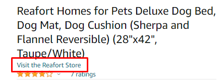
1) Organically – by clicking on the brand link on product detail pages
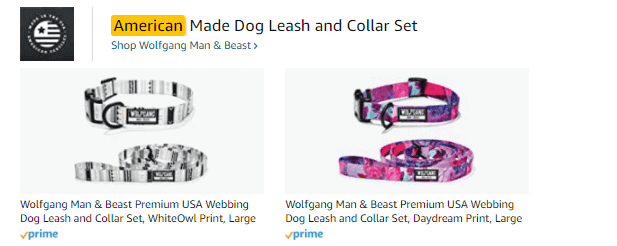
2) Via Sponsored Brand Ads
Q6: Storefront is available for which marketplaces?
North America – US, Canada, Mexico, Brazil
Europe – UK, Germany, Spain, France, Italy
Middle East – Saudi Arabia, UAE
Asia Pacific – Australia, India, Japan
Here are fun facts about the Amazon storefront
A storefront can have multiple pages, just like a website
The products displayed in the storefront can be directly linked to your product's Amazon detail pages
Storefront can also be used as a landing page for your off-Amazon campaigns
You can proudly display your reviews on the storefront. This is something you, unfortunately, cannot do in the A+ Pages
You can customize the graphics in your store for the holidays and tent pole events like Prime Day
The evolution of storefront
2018, September – Storefront launched2020 - Storefront categories were displayed in a carousel on the detail page. The section appears as a big banner, is displayed in brand colors, and is almost unmissable2020 - Amazon attempts to make the storefront more prominent on the detail page by adding "Visit the store" right below the title2020 – Shoppable images were introduced (a feature widely used by top sellers)2021 - Follow button added on the Storefront2021 – Amazon Posts now appear within the storefront
Quick tips for creating an impressive & functional storefront on Amazon
Your brand store isn't just a place to stash all of your products. It's a place to engage with your shoppers and encourage them to know more about you, convince them to buy more than one product from your brand and persuade them to keep coming back to you. There are so many brands that use Amazon storefronts as their virtual warehouse; they just stash the products and call it a storefront. No, that's not how you use it. Here are a few tips to help you make the best Amazon storefronts.
#1: Organize, organize & organize

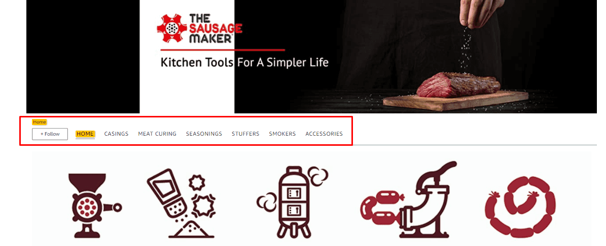
It's time to channel your inner Monica. Your brand store should be multi-page, and there should be organized categories so your customers can easily find the products they want. Imagine you sell iPhone covers for all iPhone models. Do you think customers would make an effort to find the model they want by scrolling through hundreds of products? To organize, make a list of your products, categorize them by model, size, color, or whatever theme you want to and create individual pages for each category.
#2: Movement catches the attention

It's time to put your good ol' product videos to use. Including videos in your storefront can cause your storefront conversion rates to shoot up dramatically. Any video will do – product demonstration, explanation of features and benefits, or multi-angle views. Videos are a great way to distinguish your brands from the pool of competitors.
#3: Mobile-first approach
Use the split section feature to the minimum. Each image in that section is placed one upon another, because of which the store gets extra lengthy
Make the most use of the 3000 x 1500 image. The image looks the same on mobile and desktops
Keep text to the minimum
Use videos and lifestyles
Remember the time when everyone used to say mobile is the future? That future is now. About 79% of smartphone users have made a purchase online using their mobile device in the last 6 months. With so many people accessing your online store through mobiles, making your storefront mobile-friendly is essential and not optional. Here is our take on creating mobile-friendly storefronts:
Use the split section feature to the minimum. Each image in that section is placed one upon another, because of which the store gets extra lengthy
Make the most use of the 3000 x 1500 image. The image looks the same on mobile and desktops
Keep text to the minimum
Use videos and lifestyles
#4: Focus on category pages as well
When brands create a multi-page storefront, they just focus on the home page, use the best graphics for their homepage and the rest of the pages just contain a list of products. Don't do that. All the pages of our store should be in sync and look like a part of the same brand.
#5: Add category page links on the home page
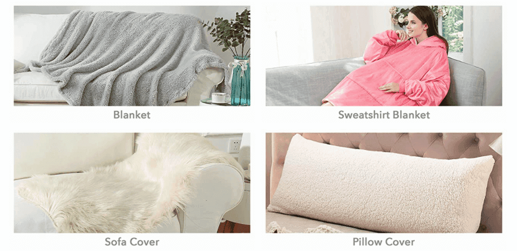
If you don't add a call-out image that directs customers to visit the category pages, then there is no point in creating category pages.
#6: Create separate pages for Best Sellers & newly launched product

Your Best Sellers deserve a special spot in the storefront, and so do the products that are just launched or are at a discount during events like Prime Day & Black Friday. Apple has used a similar strategy for its storefront, and it worked quite successfully.
#7: Use the interactive features
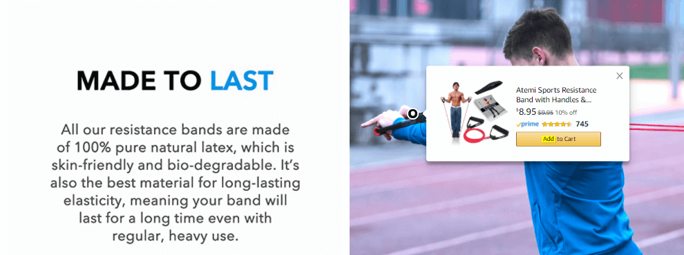
In 2020, Amazon rolled out some new interesting features that can make your storefront more interactive and engaging. This includes shoppable collection images and images with a text overlay. We have used these in some of the stores we created last year and recommend you use them in your brand store.
#8: Encourage shoppers to "follow" your brand
Your storefront is one of two ways through which a brand can gain more followers. With the Manage Your Customer's Engagement tool, you can announce your product launch, discounts, and promotions to the customers who have followed your brand. So it is vital that your storefront prompts the shoppers to follow your brand. One of the brands has brilliantly done this without actually ruining the look of the store.
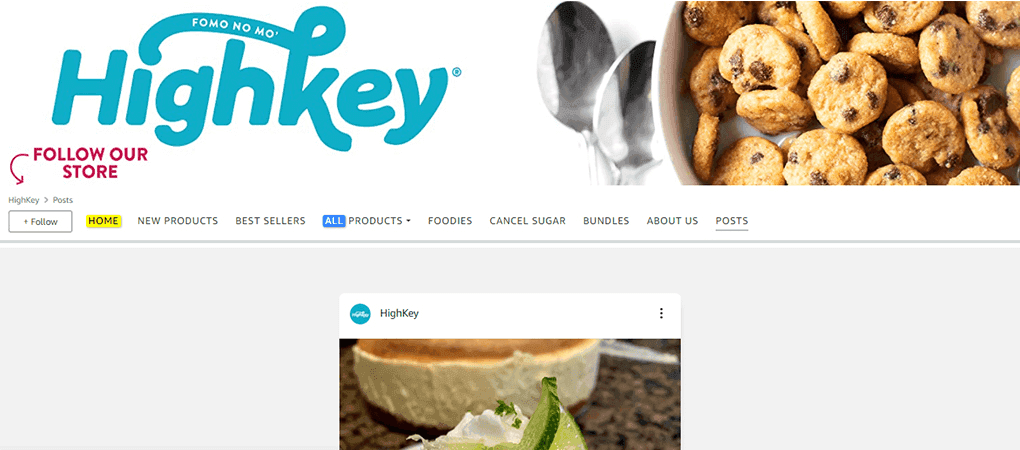
In the year 2021, we have created 30+ Amazon storefronts for our one-time clients. Here are some of our most loved, top Amazon storefronts. Feel free to get some design inspo or contact us if you would like to create the best storefronts.
Amazon storefront examples By eStore Factory
#1: Magplus

#2: Heather & Willow
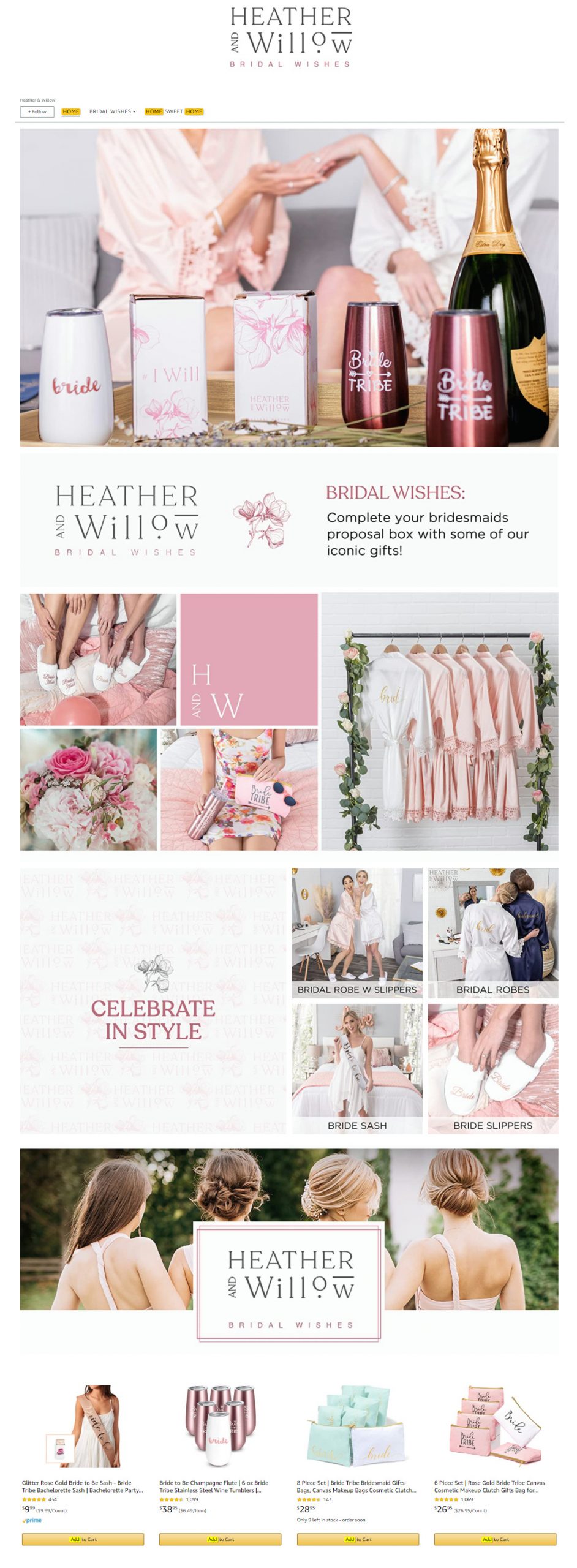
#3: Cocotribe

#4: Practical care

#5: The Spice Store

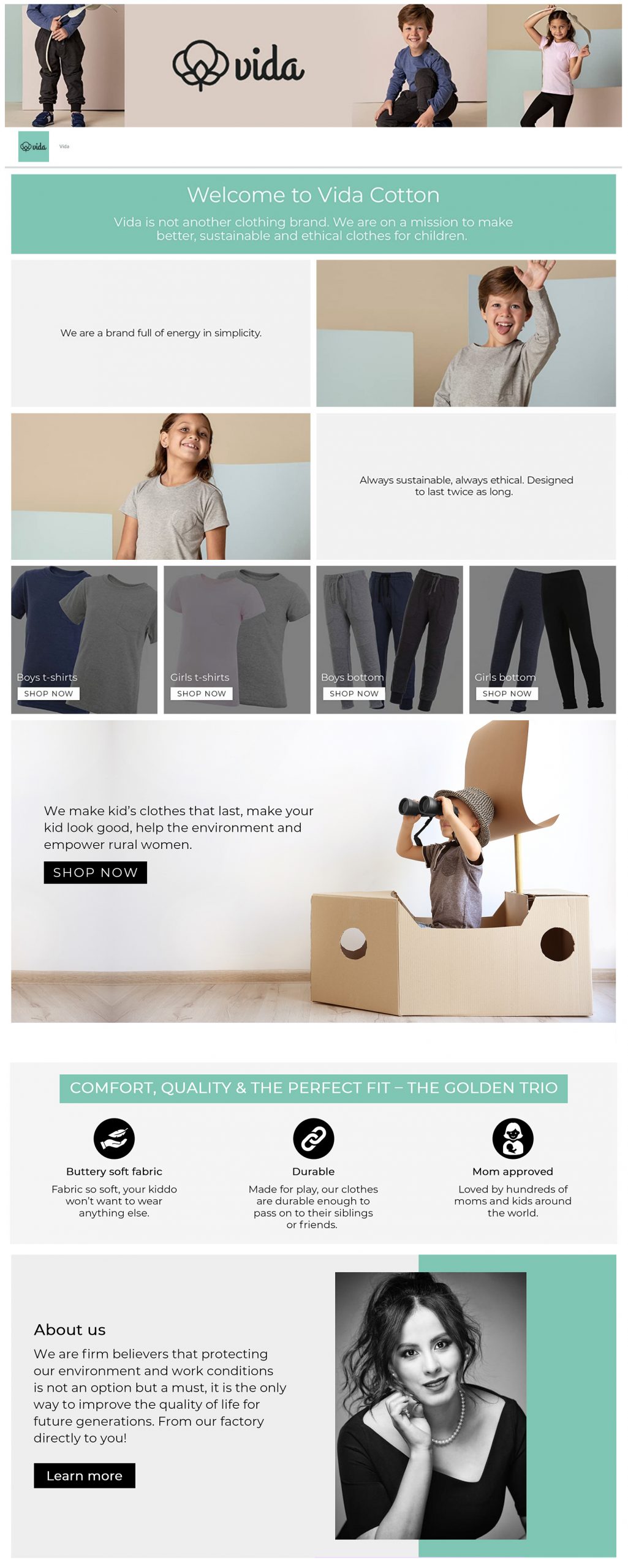
#6: The Vida Cotton
#7: AR Disc

#8: The Faith Gift Shop

#9: Elegant Image Jewelry

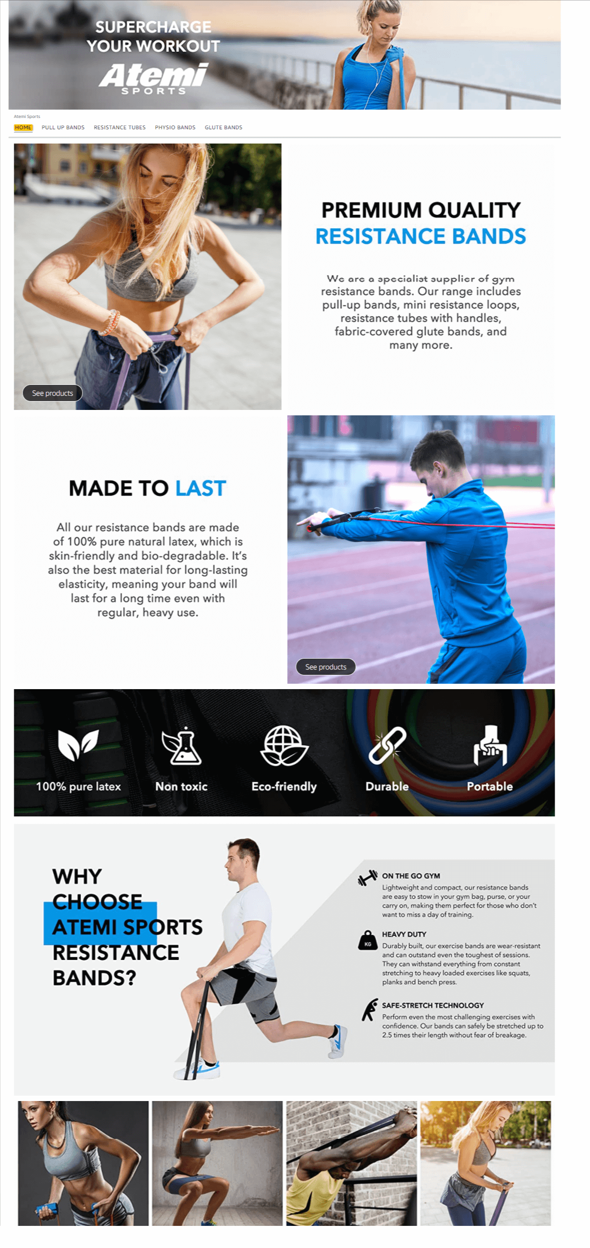
#10: Atemi Sports
Now's the time
Amazon brand stores are no longer an exciting new feature. They are a necessity for brands looking to survive and thrive in the ecosystem. Stop pushing it off your to-do list just because you think it's too expensive for your brand ATM. Any money spent on building a brand is money invested towards building your brand's credibility. So establishing a store page should be the goal of this quarter.
Need help creating a storefront?
Here's why you should choose eStore Factory to design your storefront
Times Business News recently ranked eStore Factory 8th position in its cover story, "Top 10 Amazon Consultants In the World".
We're also directly responsible for creating hundreds of successful brand stores in the past 3 years, some of which are featured in this blog.
We've been making storefronts since it first launched in 2018 and are aware of all the updates Amazon makes to the store, as well as the stringent restrictions Amazon has for storefronts
We have with us a team of 10 graphic designers exclusively working for Amazon sellers
Examples of live stores we've created
Reafort
Want to differentiate your brand from the nameless, faceless companies that mass-produced items at a cheaper cost? Amazon storefront can help you distinguish your brand and leave an impact on the customers. But it's not enough to stash all of your products in a grid and call it a storefront. You need to make sure it's functional and working towards making your brand shine.
Read on for tips, common mistakes; most asked questions, and examples of stellar storefronts created by eStore Factory.
Amazon Storefront: Answering all the commonly asked questions
Q1: What is an Amazon storefront?
As the name implies, an Amazon storefront, also called a brand store, is a dedicated section for your brand. It's a mini-me version of your website where you can display your products, tell your brand story and put your lifestyle images to use.
Q2: What are the eligibility criteria?
The only two things you'll need for a storefront are a brand registry and a professional firm that can help you design a storefront. Storefront is available to both: brand-registered sellers using Seller Central and vendors using Amazon Marketing Services (AMS).
Q3: Can I create a storefront on my own?
Amazon advertises a storefront as a DIY tool, but actually, it's not. Yes, you can attempt to create it yourself, but we think it's best to let professionals handle this. Unless you are a web developer, would you create your website on your own? No right? Amazon storefront is just as vital as your website. If your brand is relatively new, you might be getting more traffic on your storefront than on your website. Then why risk your reputation?
Q4: Speaking of traffic, how can I measure the performance of my storefront?

Amazon store features a simple to understand analytics tool called "Store Insights." Brands can get information about overall sales generated from your store, how visitors are finding your store, how each page is performing, and so much more.
Q5: How can customers find my storefront?
1) Organically – by clicking on the brand link on product detail pages

2) Via Sponsored Brand Ads

Q6: Storefront is available for which marketplaces?
North America – US, Canada, Mexico, Brazil
Europe – UK, Germany, Spain, France, Italy
Middle East – Saudi Arabia, UAE
Asia Pacific – Australia, India, Japan
Here are fun facts about the Amazon storefront
A storefront can have multiple pages, just like a website
The products displayed in the storefront can be directly linked to your product's Amazon detail pages
Storefront can also be used as a landing page for your off-Amazon campaigns
You can proudly display your reviews on the storefront. This is something you, unfortunately, cannot do in the A+ Pages
You can customize the graphics in your store for the holidays and tent pole events like Prime Day
The evolution of storefront
2018, September – Storefront launched2020 - Storefront categories were displayed in a carousel on the detail page. The section appears as a big banner, is displayed in brand colors, and is almost unmissable2020 - Amazon attempts to make the storefront more prominent on the detail page by adding "Visit the store" right below the title2020 – Shoppable images were introduced (a feature widely used by top sellers)2021 - Follow button added on the Storefront2021 – Amazon Posts now appear within the storefront
Quick tips for creating an impressive & functional storefront on Amazon
Your brand store isn't just a place to stash all of your products. It's a place to engage with your shoppers and encourage them to know more about you, convince them to buy more than one product from your brand and persuade them to keep coming back to you. There are so many brands that use Amazon storefronts as their virtual warehouse; they just stash the products and call it a storefront. No, that's not how you use it. Here are a few tips to help you make the best Amazon storefronts.
#1: Organize, organize & organize

It's time to channel your inner Monica. Your brand store should be multi-page, and there should be organized categories so your customers can easily find the products they want. Imagine you sell iPhone covers for all iPhone models. Do you think customers would make an effort to find the model they want by scrolling through hundreds of products? To organize, make a list of your products, categorize them by model, size, color, or whatever theme you want to and create individual pages for each category.

#2: Movement catches the attention

It's time to put your good ol' product videos to use. Including videos in your storefront can cause your storefront conversion rates to shoot up dramatically. Any video will do – product demonstration, explanation of features and benefits, or multi-angle views. Videos are a great way to distinguish your brands from the pool of competitors.
#3: Mobile-first approach
Use the split section feature to the minimum. Each image in that section is placed one upon another, because of which the store gets extra lengthy
Make the most use of the 3000 x 1500 image. The image looks the same on mobile and desktops
Keep text to the minimum
Use videos and lifestyles
Remember the time when everyone used to say mobile is the future? That future is now. About 79% of smartphone users have made a purchase online using their mobile device in the last 6 months. With so many people accessing your online store through mobiles, making your storefront mobile-friendly is essential and not optional. Here is our take on creating mobile-friendly storefronts:
Use the split section feature to the minimum. Each image in that section is placed one upon another, because of which the store gets extra lengthy
Make the most use of the 3000 x 1500 image. The image looks the same on mobile and desktops
Keep text to the minimum
Use videos and lifestyles
#4: Focus on category pages as well
When brands create a multi-page storefront, they just focus on the home page, use the best graphics for their homepage and the rest of the pages just contain a list of products. Don't do that. All the pages of our store should be in sync and look like a part of the same brand.
#5: Add category page links on the home page

If you don't add a call-out image that directs customers to visit the category pages, then there is no point in creating category pages.
#6: Create separate pages for Best Sellers & newly launched product

Your Best Sellers deserve a special spot in the storefront, and so do the products that are just launched or are at a discount during events like Prime Day & Black Friday. Apple has used a similar strategy for its storefront, and it worked quite successfully.
#7: Use the interactive features

In 2020, Amazon rolled out some new interesting features that can make your storefront more interactive and engaging. This includes shoppable collection images and images with a text overlay. We have used these in some of the stores we created last year and recommend you use them in your brand store.
#8: Encourage shoppers to "follow" your brand
Your storefront is one of two ways through which a brand can gain more followers. With the Manage Your Customer's Engagement tool, you can announce your product launch, discounts, and promotions to the customers who have followed your brand. So it is vital that your storefront prompts the shoppers to follow your brand. One of the brands has brilliantly done this without actually ruining the look of the store.

In the year 2021, we have created 30+ Amazon storefronts for our one-time clients. Here are some of our most loved, top Amazon storefronts. Feel free to get some design inspo or contact us if you would like to create the best storefronts.
Amazon storefront examples By eStore Factory
#1: Magplus

#2: Heather & Willow

#3: Cocotribe

#4: Practical care

#5: The Spice Store

#6: The Vida Cotton

#7: AR Disc

#8: The Faith Gift Shop

#9: Elegant Image Jewelry

#10: Atemi Sports

Now's the time
Amazon brand stores are no longer an exciting new feature. They are a necessity for brands looking to survive and thrive in the ecosystem. Stop pushing it off your to-do list just because you think it's too expensive for your brand ATM. Any money spent on building a brand is money invested towards building your brand's credibility. So establishing a store page should be the goal of this quarter.
Need help creating a storefront?
Here's why you should choose eStore Factory to design your storefront
Times Business News recently ranked eStore Factory 8th position in its cover story, "Top 10 Amazon Consultants In the World".
We're also directly responsible for creating hundreds of successful brand stores in the past 3 years, some of which are featured in this blog.
We've been making storefronts since it first launched in 2018 and are aware of all the updates Amazon makes to the store, as well as the stringent restrictions Amazon has for storefronts
We have with us a team of 10 graphic designers exclusively working for Amazon sellers
Examples of live stores we've created
Reafort
Want to differentiate your brand from the nameless, faceless companies that mass-produced items at a cheaper cost? Amazon storefront can help you distinguish your brand and leave an impact on the customers. But it's not enough to stash all of your products in a grid and call it a storefront. You need to make sure it's functional and working towards making your brand shine.
Read on for tips, common mistakes; most asked questions, and examples of stellar storefronts created by eStore Factory.
Amazon Storefront: Answering all the commonly asked questions
Q1: What is an Amazon storefront?
As the name implies, an Amazon storefront, also called a brand store, is a dedicated section for your brand. It's a mini-me version of your website where you can display your products, tell your brand story and put your lifestyle images to use.
Q2: What are the eligibility criteria?
The only two things you'll need for a storefront are a brand registry and a professional firm that can help you design a storefront. Storefront is available to both: brand-registered sellers using Seller Central and vendors using Amazon Marketing Services (AMS).
Q3: Can I create a storefront on my own?
Amazon advertises a storefront as a DIY tool, but actually, it's not. Yes, you can attempt to create it yourself, but we think it's best to let professionals handle this. Unless you are a web developer, would you create your website on your own? No right? Amazon storefront is just as vital as your website. If your brand is relatively new, you might be getting more traffic on your storefront than on your website. Then why risk your reputation?
Q4: Speaking of traffic, how can I measure the performance of my storefront?

Amazon store features a simple to understand analytics tool called "Store Insights." Brands can get information about overall sales generated from your store, how visitors are finding your store, how each page is performing, and so much more.
Q5: How can customers find my storefront?
1) Organically – by clicking on the brand link on product detail pages

2) Via Sponsored Brand Ads

Q6: Storefront is available for which marketplaces?
North America – US, Canada, Mexico, Brazil
Europe – UK, Germany, Spain, France, Italy
Middle East – Saudi Arabia, UAE
Asia Pacific – Australia, India, Japan
Here are fun facts about the Amazon storefront
A storefront can have multiple pages, just like a website
The products displayed in the storefront can be directly linked to your product's Amazon detail pages
Storefront can also be used as a landing page for your off-Amazon campaigns
You can proudly display your reviews on the storefront. This is something you, unfortunately, cannot do in the A+ Pages
You can customize the graphics in your store for the holidays and tent pole events like Prime Day
The evolution of storefront
2018, September – Storefront launched2020 - Storefront categories were displayed in a carousel on the detail page. The section appears as a big banner, is displayed in brand colors, and is almost unmissable2020 - Amazon attempts to make the storefront more prominent on the detail page by adding "Visit the store" right below the title2020 – Shoppable images were introduced (a feature widely used by top sellers)2021 - Follow button added on the Storefront2021 – Amazon Posts now appear within the storefront
Quick tips for creating an impressive & functional storefront on Amazon
Your brand store isn't just a place to stash all of your products. It's a place to engage with your shoppers and encourage them to know more about you, convince them to buy more than one product from your brand and persuade them to keep coming back to you. There are so many brands that use Amazon storefronts as their virtual warehouse; they just stash the products and call it a storefront. No, that's not how you use it. Here are a few tips to help you make the best Amazon storefronts.
#1: Organize, organize & organize

It's time to channel your inner Monica. Your brand store should be multi-page, and there should be organized categories so your customers can easily find the products they want. Imagine you sell iPhone covers for all iPhone models. Do you think customers would make an effort to find the model they want by scrolling through hundreds of products? To organize, make a list of your products, categorize them by model, size, color, or whatever theme you want to and create individual pages for each category.

#2: Movement catches the attention

It's time to put your good ol' product videos to use. Including videos in your storefront can cause your storefront conversion rates to shoot up dramatically. Any video will do – product demonstration, explanation of features and benefits, or multi-angle views. Videos are a great way to distinguish your brands from the pool of competitors.
#3: Mobile-first approach
Use the split section feature to the minimum. Each image in that section is placed one upon another, because of which the store gets extra lengthy
Make the most use of the 3000 x 1500 image. The image looks the same on mobile and desktops
Keep text to the minimum
Use videos and lifestyles
Remember the time when everyone used to say mobile is the future? That future is now. About 79% of smartphone users have made a purchase online using their mobile device in the last 6 months. With so many people accessing your online store through mobiles, making your storefront mobile-friendly is essential and not optional. Here is our take on creating mobile-friendly storefronts:
Use the split section feature to the minimum. Each image in that section is placed one upon another, because of which the store gets extra lengthy
Make the most use of the 3000 x 1500 image. The image looks the same on mobile and desktops
Keep text to the minimum
Use videos and lifestyles
#4: Focus on category pages as well
When brands create a multi-page storefront, they just focus on the home page, use the best graphics for their homepage and the rest of the pages just contain a list of products. Don't do that. All the pages of our store should be in sync and look like a part of the same brand.
#5: Add category page links on the home page

If you don't add a call-out image that directs customers to visit the category pages, then there is no point in creating category pages.
#6: Create separate pages for Best Sellers & newly launched product

Your Best Sellers deserve a special spot in the storefront, and so do the products that are just launched or are at a discount during events like Prime Day & Black Friday. Apple has used a similar strategy for its storefront, and it worked quite successfully.
#7: Use the interactive features

In 2020, Amazon rolled out some new interesting features that can make your storefront more interactive and engaging. This includes shoppable collection images and images with a text overlay. We have used these in some of the stores we created last year and recommend you use them in your brand store.
#8: Encourage shoppers to "follow" your brand
Your storefront is one of two ways through which a brand can gain more followers. With the Manage Your Customer's Engagement tool, you can announce your product launch, discounts, and promotions to the customers who have followed your brand. So it is vital that your storefront prompts the shoppers to follow your brand. One of the brands has brilliantly done this without actually ruining the look of the store.

In the year 2021, we have created 30+ Amazon storefronts for our one-time clients. Here are some of our most loved, top Amazon storefronts. Feel free to get some design inspo or contact us if you would like to create the best storefronts.
Amazon storefront examples By eStore Factory
#1: Magplus

#2: Heather & Willow

#3: Cocotribe

#4: Practical care

#5: The Spice Store

#6: The Vida Cotton

#7: AR Disc

#8: The Faith Gift Shop

#9: Elegant Image Jewelry

#10: Atemi Sports

Now's the time
Amazon brand stores are no longer an exciting new feature. They are a necessity for brands looking to survive and thrive in the ecosystem. Stop pushing it off your to-do list just because you think it's too expensive for your brand ATM. Any money spent on building a brand is money invested towards building your brand's credibility. So establishing a store page should be the goal of this quarter.
Need help creating a storefront?
Here's why you should choose eStore Factory to design your storefront
Times Business News recently ranked eStore Factory 8th position in its cover story, "Top 10 Amazon Consultants In the World".
We're also directly responsible for creating hundreds of successful brand stores in the past 3 years, some of which are featured in this blog.
We've been making storefronts since it first launched in 2018 and are aware of all the updates Amazon makes to the store, as well as the stringent restrictions Amazon has for storefronts
We have with us a team of 10 graphic designers exclusively working for Amazon sellers
Examples of live stores we've created
Reafort


