Back to Page
Amazon A+ Content
Top 10 Amazon Enhanced Brand Content
Top 10 Amazon Enhanced Brand Content


Back to Page
Amazon A+ Content
Top 10 Amazon Enhanced Brand Content

Amazon A Plus Content are no more an interesting, new feature; they are a necessity.
It’s no secret that Amazon is favoring brands more than ever. 90% of the recent updates rolled out by the e-commerce mogul are for the brand–registered sellers. Establishing a brand shoppers’ trust won’t just help you get some special treatment from Amazon but also help you get the edge you were looking for. One of the most compelling features to do this is by creating Amazon branded content. In this article, we’ll go over:
Amazon A+ page
What is Amazon A+ Page?
The Dos' & Don'ts
Tips for creating the best Amazon Enhanced Brand Content
6 Reasons to give Amazon A Plus Content a try:

Reason #1: Give your product a much-needed conversion boost (up to 10%)
According to a study conducted by Amazon, when made correctly, Amazon Enhanced Brand Content can increase your conversion by 3-10%. While the average increase in conversion is 5-6%. Now that's big! Products with the best A+ Content convert better than those with don't because of a single reason. Customers are fed with the information they need to make a purchase. As a result, they don't find the need to wander and find a better product.
Reason #2: Because the title, bullets, and images are not enough, they never are!
The more, the merrier. As shoppers are not physically present, every shot of the product and every little piece of information takes them closer to a confident purchase. Plus, you can't add a lot of information in your bullet points, or they look text-y and the description is barely 2000 characters with spaces and HTML. On top of that, the stringent rules for Amazon infographic images leave less room for creativity. With enhanced content Amazon, you can give wings to your imagination and let your product be the star of the show (with, of course, a tiny list of content rules and regulations.)
Reason #3: Prevent your product detail page from looking like a software agreement:
No one wants to read the boring text! Would you like to read this?

Or rather this -
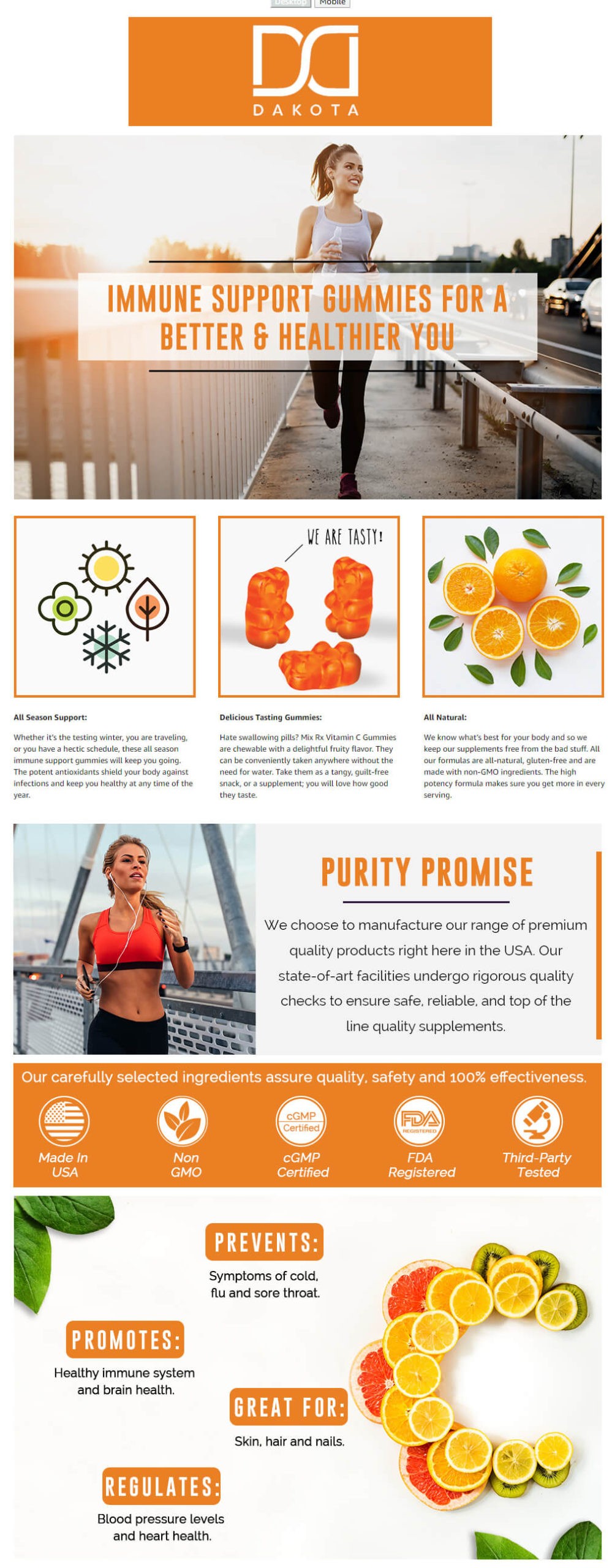
That's it for this point. No further discussion.
Reason #4: Help your shoppers to "stay" on the product detail page
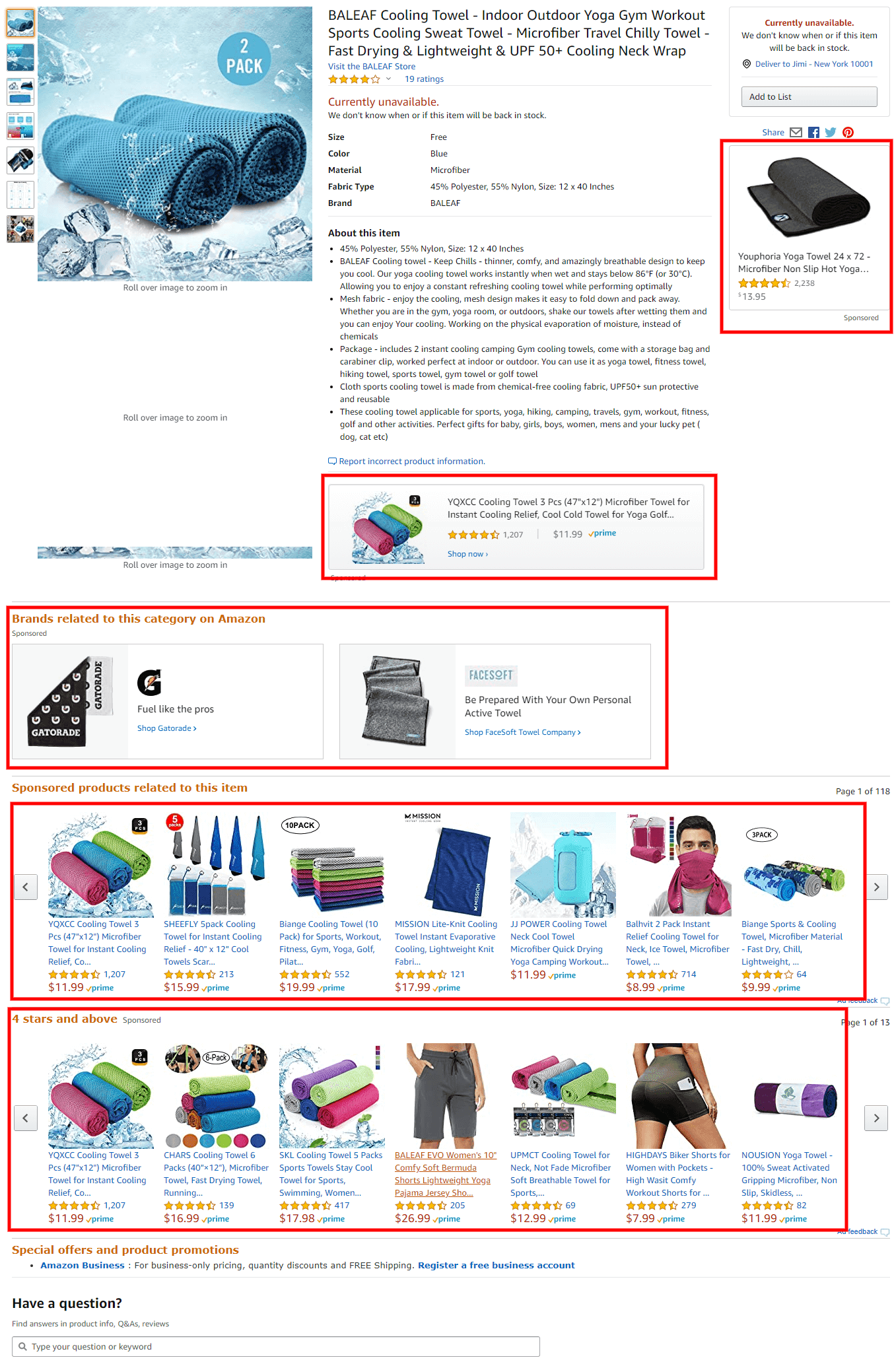
You might think that bringing the shoppers to the product detail page is the most challenging task ever. But at least did you know that the battle has just begun! These days Amazon is increasingly inclining towards sponsored results to the extent that it is replacing organic product suggestions on the product detail page with sponsored ads. Take a look at the example below. Right after the bullet points, you can see the "Brands related to this category on Amazon" section clicking on which will take the shoppers directly to the sponsored storefront. If that wasn't enough, there are two more sections, sponsored obviously, named "Sponsored products related to this item" and "4 stars and above". Phew! Seems like the product detail page has more competition than the search result pages. So it is necessary that it stands out and Amazon A+ Content is built exactly for that.
Reason #5: Tell why your brand is great
Cliché but true. The brand story works wonders in convincing a buyer. Would like to buy from a brand where a Mexican mother sells handcrafted sauces for all the families in the U.S. and the sauces are made without any preservatives or from an anonymous brand you don't know about. The answer is pretty obvious. As humans, we connect to the story because it triggers a biological response. A+ Content can be your little corner to highlight how your brand was created and why customers should trust you.
Reason #6: Cross-selling opportunities
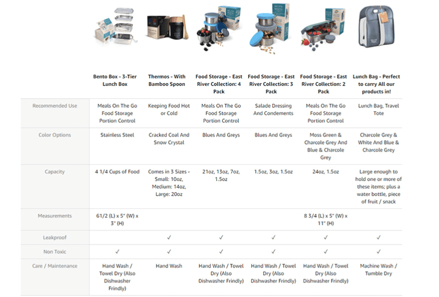
The comparison module on your product detail page allows you to showcase the various features of the cousin products of your catalog and opens up the chance of cross-selling. When the customer clicks on the product shown on the module, they will be redirected to the respective product detail page. I am so amazed when sellers create an A+ Page and don't agree to add a comparison module. That's an essential thing! You can advertise your product for completely free. You can add color variations, flavors, or even completely unrelated products, doesn't matter! What matters is that you are helping the other listings of your catalog grow.
Reason #7: Best Amazon A+ Pages can help you woo the shoppers before you get social proof:
Reviews and conversion/sales are like the centuries-long dilemma of chicken and egg. You need a strong base of reviews for sales and a good amount of sales for reviews. So what helps? Turns out that if your listing is just launched and you don’t have any reviews then the best Amazon A+ Content can help your shoppers trust you as a brand.
Back to basics:
Now that you're convinced to create an A+ Page for your product detail page, let us refresh your knowledge of A+ Pages.
What is A+ Content?
Formerly known as Enhanced Brand Content, Amazon A+ Content lets Amazon sellers and vendors spruce up their HTML product descriptions with lifelike images, hero banners, crisp text placements, and comparison modules.
Who is eligible:
All the sellers with brand registry 2.0 can create A+ Pages.
Is there a fee?
At present A+ Content is available free to the eligible sellers. Make sure to take advantage of it before Amazon monetizes it.
Is A+ Content indexed?
No, it isn't; still, it would be a good practice to try and keep some text out of the images. However, your description will be indexed from the backend.
Know more about A+ Pages here:
It's Amazon; they have rules for everything
Amazon has a very stringent policy when it comes to A+ Pages. There are some things you can do and a lot you can't do. Most of them are apparent like making sure the text in the images is readable and images shouldn't be blurred so I won't bore you with things you already know. Below I have listed the not-so-obvious don'ts of the creating best Amazon EBC:
Don't write words such as cheapest, free, best, affordable price, environment friendly, certificate, awards, buy now, FDA approved, customer satisfaction, recommended by, certified, tested, approved, proven, validated
Don't add any icons or symbols that reflect the above words
Don't add copyright, trademark, or registered symbols. Remove any such symbols from your logo as well
Don't write editorial or 3rd party quotes from external sources such as magazines and television shows.
Don't write shipping information or anything related
Don't make any mention of guarantee and warranty information
It is ironic that even being so rigid in following these rules, Amazon chooses to favor some of the buyers by letting them write whatever they want. Take a look at the example below. The brand has broken three rules in just one banner. They have made claims for customer satisfaction and for being the #1 American brand. The A+ Page is still alive and thriving. This is just one and there are so many other such instances. Although you don't have any other option to follow the rules, in the end, it completely depends on the person or the system that reviews the A+ Page. Good luck!
Want some EBC-inspo? Check out these 10 best Amazon Enhanced Brand Content Examples:
#1: Mellow Cosmetics
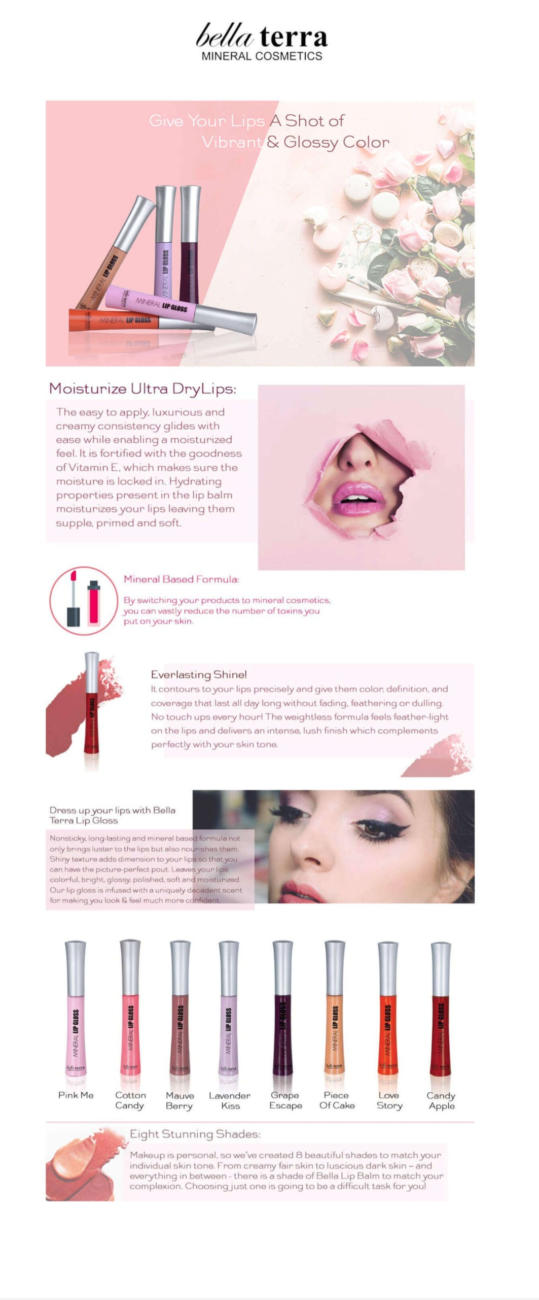
#2: Everyday Stacks
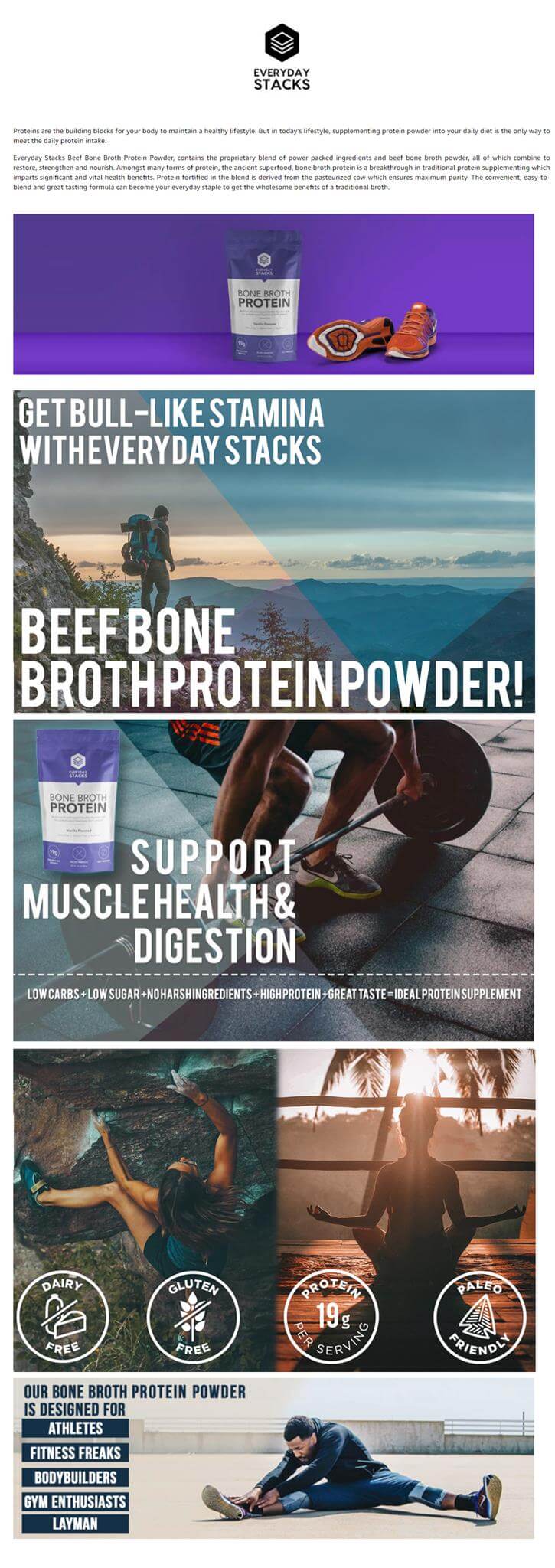
#3: 8Cellent
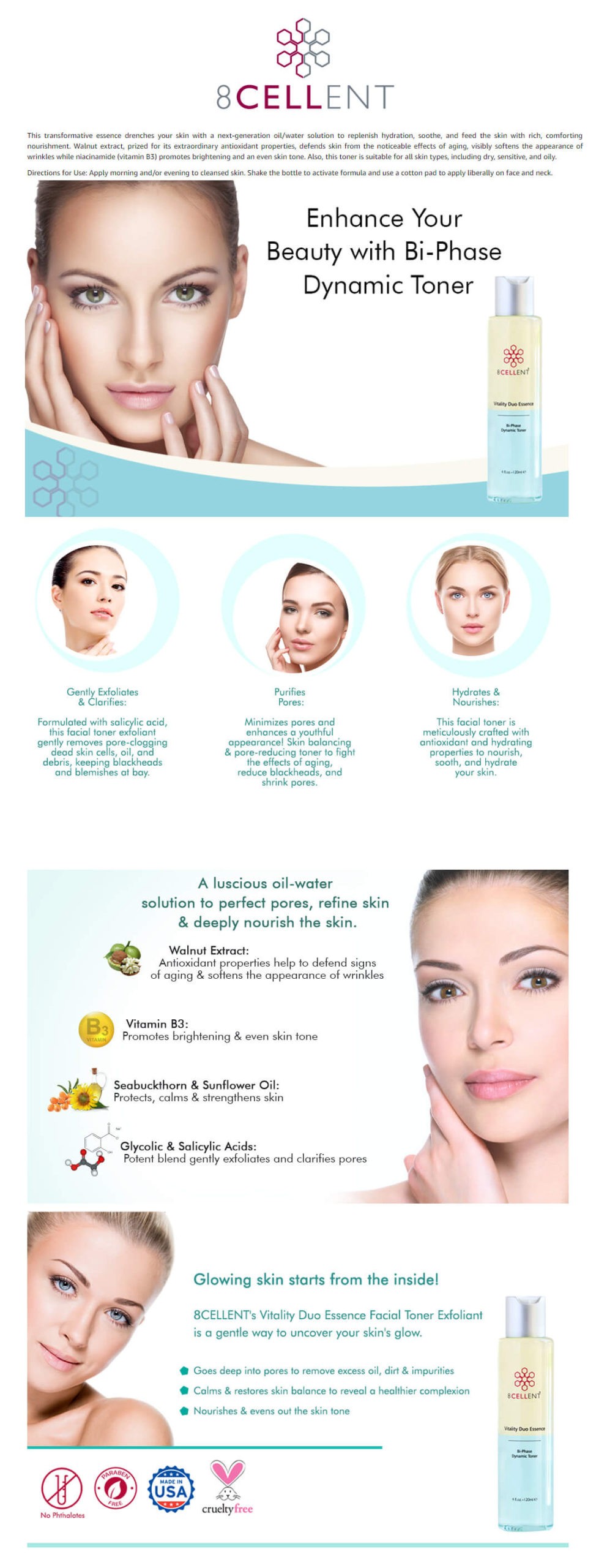
#4: Peak Coffee
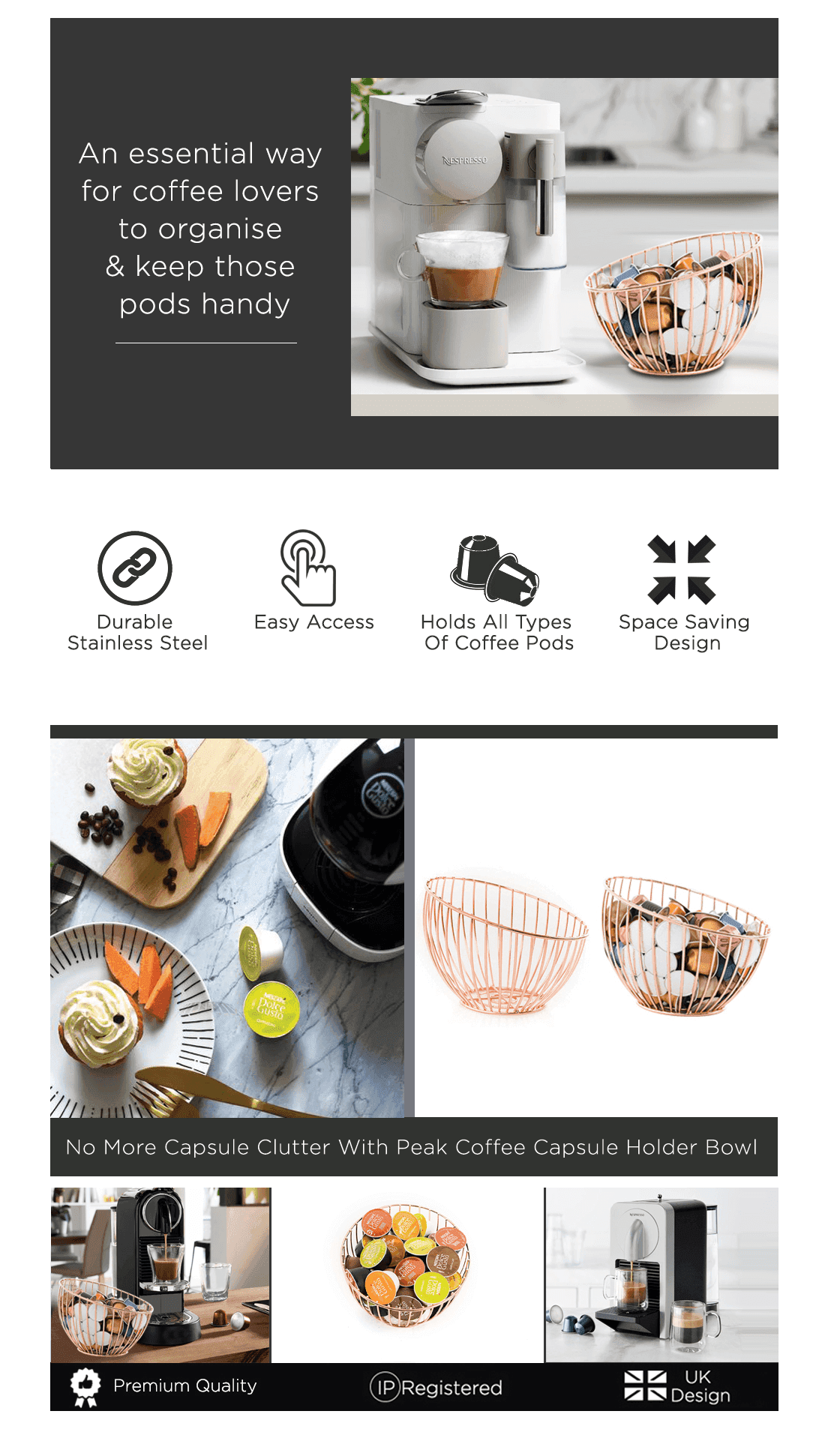
#5: Enkloze
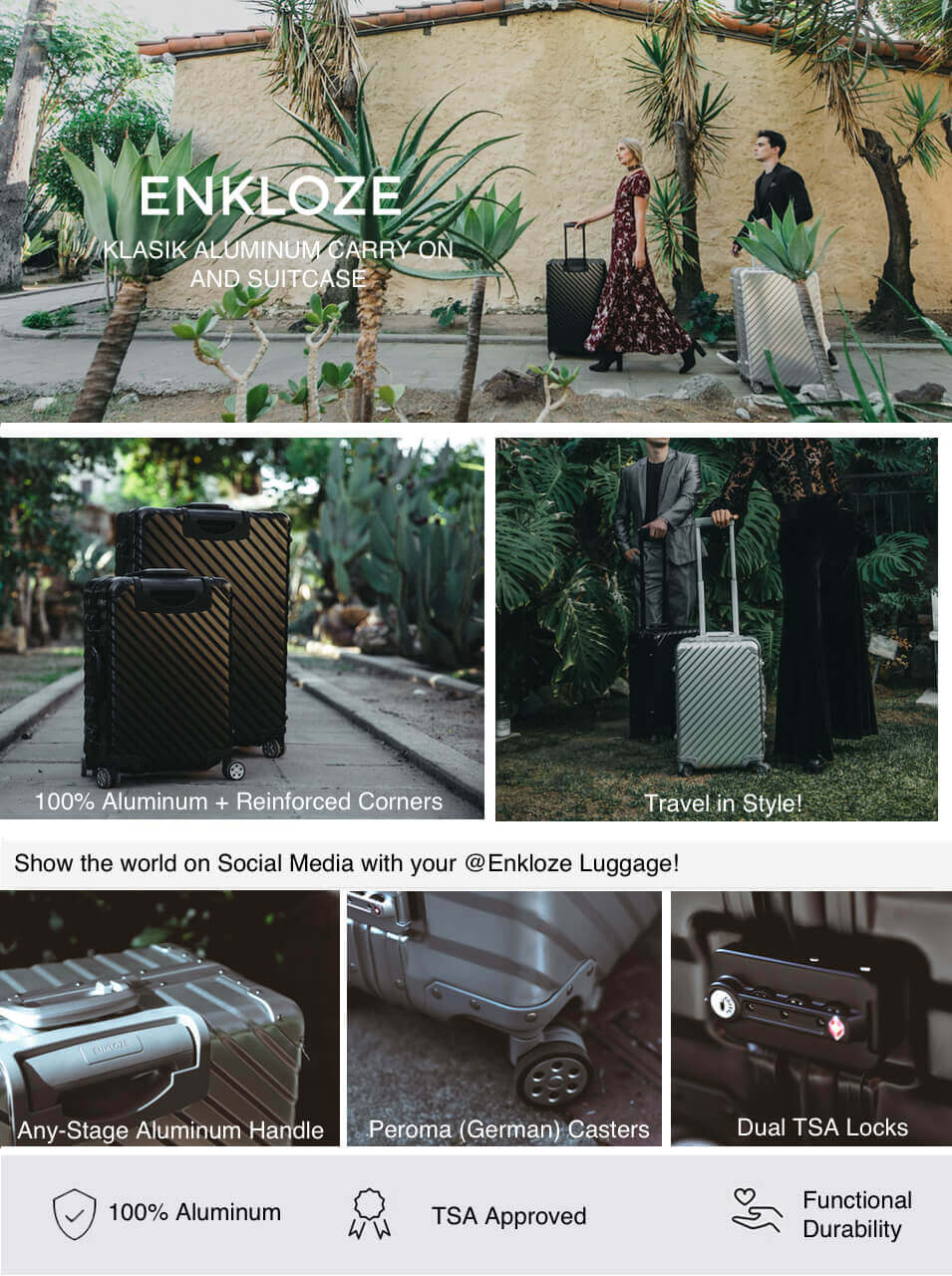
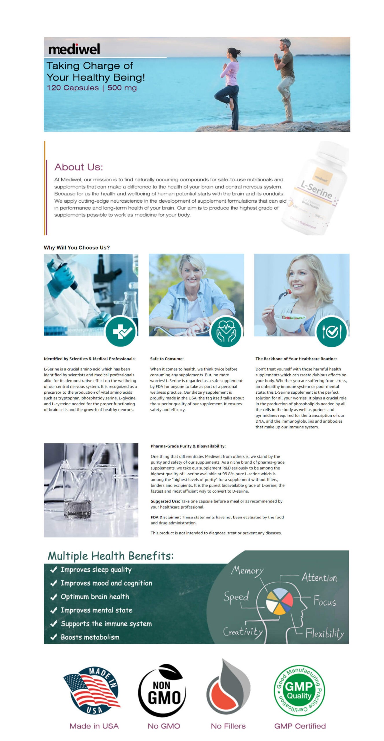
#6: mediwel
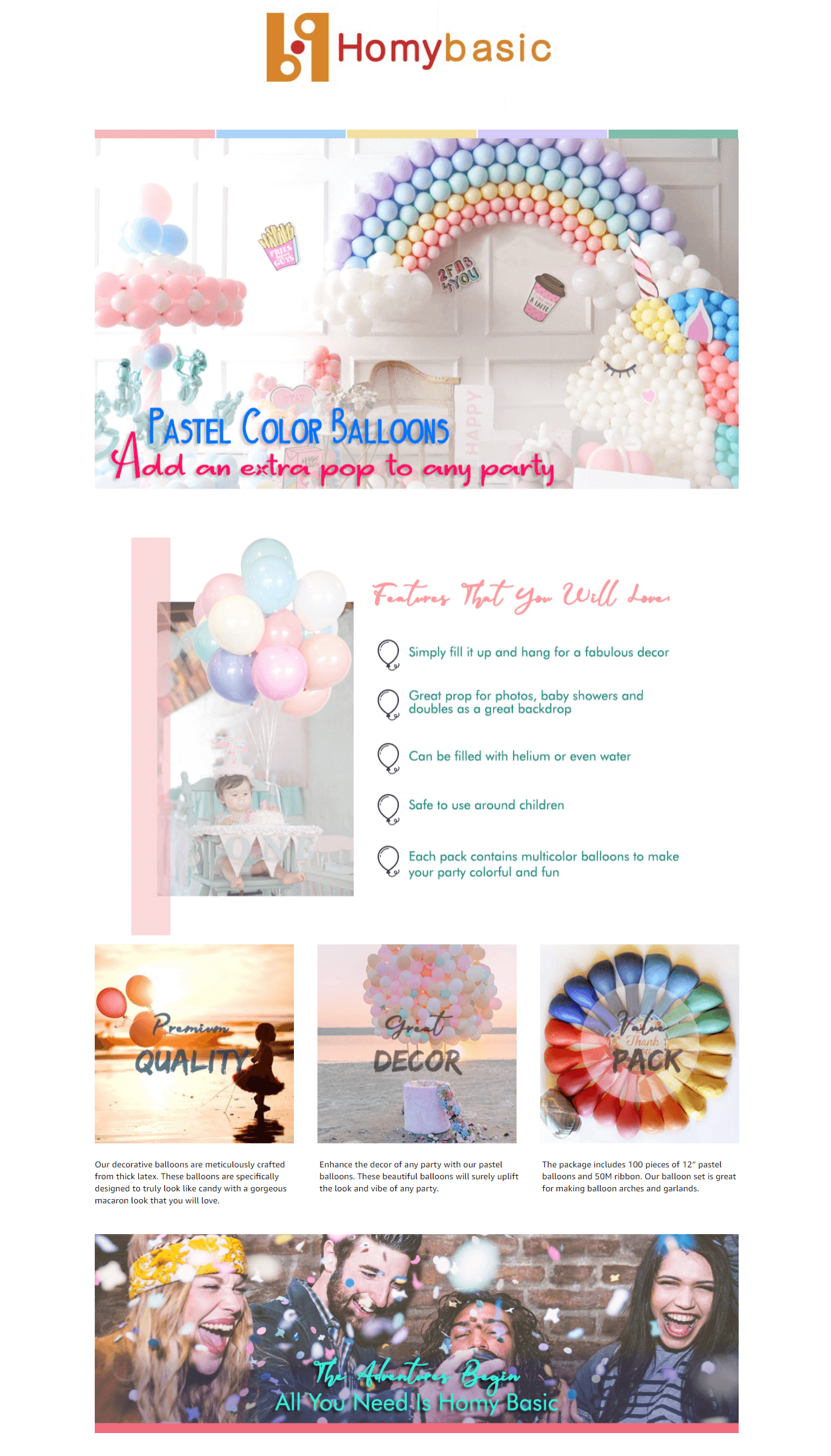
#7: Homybasic
#8: Fashion Boomy

#9: Teesware

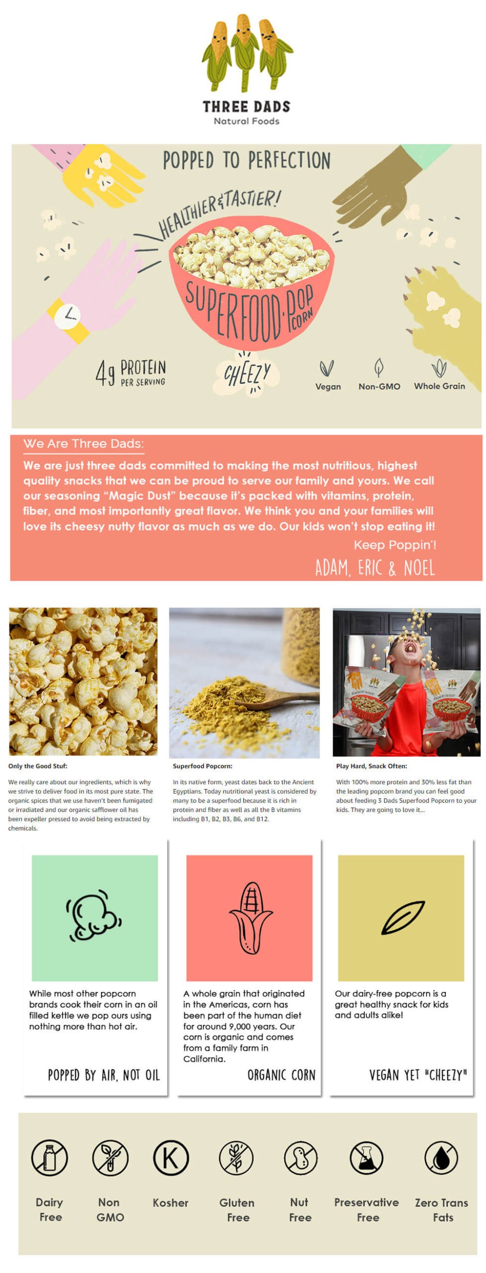
#10: Three Dads Natural Foods
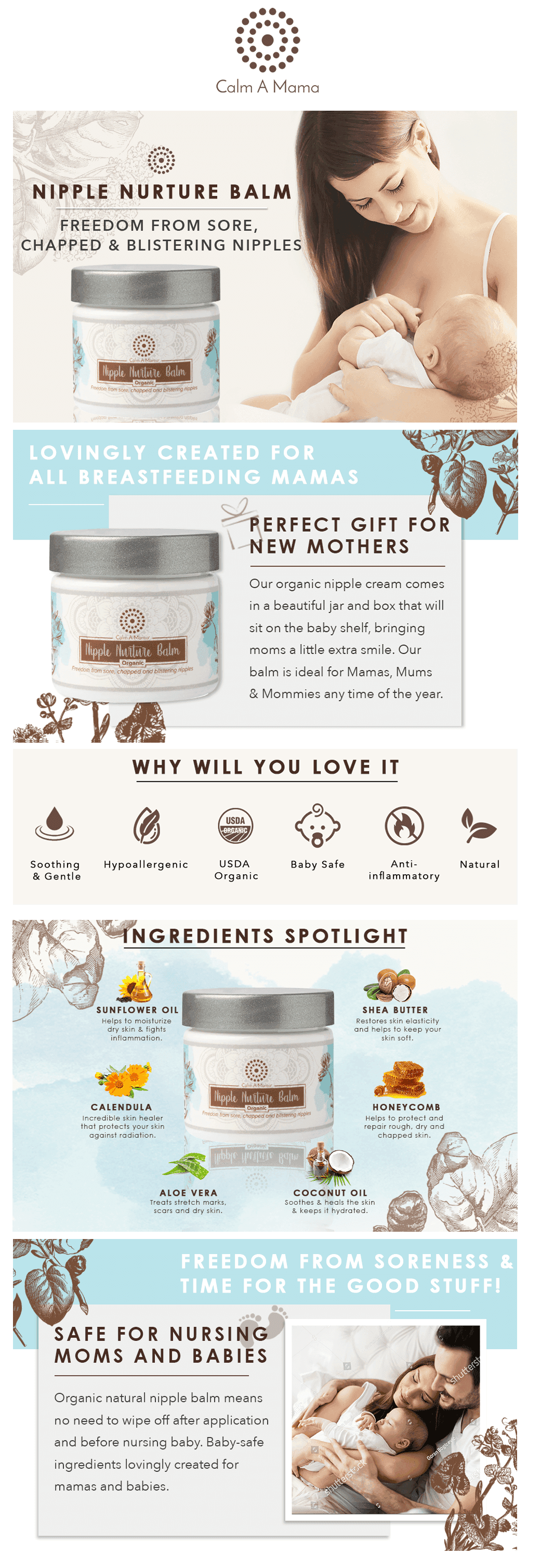
#Bonus: Calm A Mama
Tips for creating the best A+ Content on Amazon:
Don't make your A+ Page text-heavy. Extra-long paragraphs, confusing language, and unknown abbreviations can distract the customer, so it's better to cut the clutter and keep it short and to the point.
Always add alt-tag keywords. These won't be indexed by Amazon but are indexed by Google and are also used for screen reader applications for visually impaired shoppers.
Either click great lifestyle images or create realistic lifestyle composite images. In short, images are the life and soul of your A+ Page; they need to be the best.
Scroll down your listing, read the common customer questions, read why you've got negative reviews, and try to answer/resolve them in your A+ Content.
You might have to edit your bullet points after creating an A+ Page. There are a few things we can't add to in A+ Page. For example, if you have warranty guarantee information in your description and you don't have it in your bullet points, then you should be editing the bullet points as well. You can always take the help of our Amazon listing optimization services for that.
Check for mobile. About 150 million customers shopped from mobile apps in 2019, so make sure the A+ Content looks just as larger than life on mobile as it does on desktops. Luckily Amazon allows you to preview your A+ Page for mobile while you upload the content so you can eliminate the guesswork. The A+ Content Examples we have listed are all mobile-friendly.
It all works in synergy. The specialized product description works best for increasing the conversion of your best-selling ASINs. It's not a quick fix for your slow-moving inventory. But if you are launching a new product, the best Amazon A+ Pages combined with Amazon PPC optimization can help you get a boost. Plus, A+ Pages are one of the most important elements to make your page retail-ready.
A/B test and see what works best. Learn more about A/B testing of A+ Content here.
Although Amazon advertises A+ Page as a self-service tool, it is not.
There are many things you need to take care of, rules to follow, and the main thing, not every one of us is a designer. You need expert guidance and creativity, or the A+ Page might end up reducing the conversion. Investing in Amazon EBC Services from a reputed firm like eStore Factory can give you long-term dividends in the form of increased conversion, sales, and ranking. What are you waiting for? Contact our Amazon consultants and make the most of the not-so-attractive description space available.
Amazon A Plus Content are no more an interesting, new feature; they are a necessity.
It’s no secret that Amazon is favoring brands more than ever. 90% of the recent updates rolled out by the e-commerce mogul are for the brand–registered sellers. Establishing a brand shoppers’ trust won’t just help you get some special treatment from Amazon but also help you get the edge you were looking for. One of the most compelling features to do this is by creating Amazon branded content. In this article, we’ll go over:
Amazon A+ page
What is Amazon A+ Page?
The Dos' & Don'ts
Tips for creating the best Amazon Enhanced Brand Content
6 Reasons to give Amazon A Plus Content a try:

Reason #1: Give your product a much-needed conversion boost (up to 10%)
According to a study conducted by Amazon, when made correctly, Amazon Enhanced Brand Content can increase your conversion by 3-10%. While the average increase in conversion is 5-6%. Now that's big! Products with the best A+ Content convert better than those with don't because of a single reason. Customers are fed with the information they need to make a purchase. As a result, they don't find the need to wander and find a better product.
Reason #2: Because the title, bullets, and images are not enough, they never are!
The more, the merrier. As shoppers are not physically present, every shot of the product and every little piece of information takes them closer to a confident purchase. Plus, you can't add a lot of information in your bullet points, or they look text-y and the description is barely 2000 characters with spaces and HTML. On top of that, the stringent rules for Amazon infographic images leave less room for creativity. With enhanced content Amazon, you can give wings to your imagination and let your product be the star of the show (with, of course, a tiny list of content rules and regulations.)
Reason #3: Prevent your product detail page from looking like a software agreement:
No one wants to read the boring text! Would you like to read this?

Or rather this -

That's it for this point. No further discussion.
Reason #4: Help your shoppers to "stay" on the product detail page
You might think that bringing the shoppers to the product detail page is the most challenging task ever. But at least did you know that the battle has just begun! These days Amazon is increasingly inclining towards sponsored results to the extent that it is replacing organic product suggestions on the product detail page with sponsored ads. Take a look at the example below. Right after the bullet points, you can see the "Brands related to this category on Amazon" section clicking on which will take the shoppers directly to the sponsored storefront. If that wasn't enough, there are two more sections, sponsored obviously, named "Sponsored products related to this item" and "4 stars and above". Phew! Seems like the product detail page has more competition than the search result pages. So it is necessary that it stands out and Amazon A+ Content is built exactly for that.

Reason #5: Tell why your brand is great
Cliché but true. The brand story works wonders in convincing a buyer. Would like to buy from a brand where a Mexican mother sells handcrafted sauces for all the families in the U.S. and the sauces are made without any preservatives or from an anonymous brand you don't know about. The answer is pretty obvious. As humans, we connect to the story because it triggers a biological response. A+ Content can be your little corner to highlight how your brand was created and why customers should trust you.
Reason #6: Cross-selling opportunities
The comparison module on your product detail page allows you to showcase the various features of the cousin products of your catalog and opens up the chance of cross-selling. When the customer clicks on the product shown on the module, they will be redirected to the respective product detail page. I am so amazed when sellers create an A+ Page and don't agree to add a comparison module. That's an essential thing! You can advertise your product for completely free. You can add color variations, flavors, or even completely unrelated products, doesn't matter! What matters is that you are helping the other listings of your catalog grow.

Reason #7: Best Amazon A+ Pages can help you woo the shoppers before you get social proof:
Reviews and conversion/sales are like the centuries-long dilemma of chicken and egg. You need a strong base of reviews for sales and a good amount of sales for reviews. So what helps? Turns out that if your listing is just launched and you don’t have any reviews then the best Amazon A+ Content can help your shoppers trust you as a brand.
Back to basics:
Now that you're convinced to create an A+ Page for your product detail page, let us refresh your knowledge of A+ Pages.
What is A+ Content?
Formerly known as Enhanced Brand Content, Amazon A+ Content lets Amazon sellers and vendors spruce up their HTML product descriptions with lifelike images, hero banners, crisp text placements, and comparison modules.
Who is eligible:
All the sellers with brand registry 2.0 can create A+ Pages.
Is there a fee?
At present A+ Content is available free to the eligible sellers. Make sure to take advantage of it before Amazon monetizes it.
Is A+ Content indexed?
No, it isn't; still, it would be a good practice to try and keep some text out of the images. However, your description will be indexed from the backend.
Know more about A+ Pages here:
It's Amazon; they have rules for everything
Amazon has a very stringent policy when it comes to A+ Pages. There are some things you can do and a lot you can't do. Most of them are apparent like making sure the text in the images is readable and images shouldn't be blurred so I won't bore you with things you already know. Below I have listed the not-so-obvious don'ts of the creating best Amazon EBC:
Don't write words such as cheapest, free, best, affordable price, environment friendly, certificate, awards, buy now, FDA approved, customer satisfaction, recommended by, certified, tested, approved, proven, validated
Don't add any icons or symbols that reflect the above words
Don't add copyright, trademark, or registered symbols. Remove any such symbols from your logo as well
Don't write editorial or 3rd party quotes from external sources such as magazines and television shows.
Don't write shipping information or anything related
Don't make any mention of guarantee and warranty information
It is ironic that even being so rigid in following these rules, Amazon chooses to favor some of the buyers by letting them write whatever they want. Take a look at the example below. The brand has broken three rules in just one banner. They have made claims for customer satisfaction and for being the #1 American brand. The A+ Page is still alive and thriving. This is just one and there are so many other such instances. Although you don't have any other option to follow the rules, in the end, it completely depends on the person or the system that reviews the A+ Page. Good luck!
Want some EBC-inspo? Check out these 10 best Amazon Enhanced Brand Content Examples:
#1: Mellow Cosmetics

#2: Everyday Stacks

#3: 8Cellent

#4: Peak Coffee

#5: Enkloze

#6: mediwel

#7: Homybasic

#8: Fashion Boomy

#9: Teesware

#10: Three Dads Natural Foods

#Bonus: Calm A Mama

Tips for creating the best A+ Content on Amazon:
Don't make your A+ Page text-heavy. Extra-long paragraphs, confusing language, and unknown abbreviations can distract the customer, so it's better to cut the clutter and keep it short and to the point.
Always add alt-tag keywords. These won't be indexed by Amazon but are indexed by Google and are also used for screen reader applications for visually impaired shoppers.
Either click great lifestyle images or create realistic lifestyle composite images. In short, images are the life and soul of your A+ Page; they need to be the best.
Scroll down your listing, read the common customer questions, read why you've got negative reviews, and try to answer/resolve them in your A+ Content.
You might have to edit your bullet points after creating an A+ Page. There are a few things we can't add to in A+ Page. For example, if you have warranty guarantee information in your description and you don't have it in your bullet points, then you should be editing the bullet points as well. You can always take the help of our Amazon listing optimization services for that.
Check for mobile. About 150 million customers shopped from mobile apps in 2019, so make sure the A+ Content looks just as larger than life on mobile as it does on desktops. Luckily Amazon allows you to preview your A+ Page for mobile while you upload the content so you can eliminate the guesswork. The A+ Content Examples we have listed are all mobile-friendly.
It all works in synergy. The specialized product description works best for increasing the conversion of your best-selling ASINs. It's not a quick fix for your slow-moving inventory. But if you are launching a new product, the best Amazon A+ Pages combined with Amazon PPC optimization can help you get a boost. Plus, A+ Pages are one of the most important elements to make your page retail-ready.
A/B test and see what works best. Learn more about A/B testing of A+ Content here.
Although Amazon advertises A+ Page as a self-service tool, it is not.
There are many things you need to take care of, rules to follow, and the main thing, not every one of us is a designer. You need expert guidance and creativity, or the A+ Page might end up reducing the conversion. Investing in Amazon EBC Services from a reputed firm like eStore Factory can give you long-term dividends in the form of increased conversion, sales, and ranking. What are you waiting for? Contact our Amazon consultants and make the most of the not-so-attractive description space available.
Amazon A Plus Content are no more an interesting, new feature; they are a necessity.
It’s no secret that Amazon is favoring brands more than ever. 90% of the recent updates rolled out by the e-commerce mogul are for the brand–registered sellers. Establishing a brand shoppers’ trust won’t just help you get some special treatment from Amazon but also help you get the edge you were looking for. One of the most compelling features to do this is by creating Amazon branded content. In this article, we’ll go over:
Amazon A+ page
What is Amazon A+ Page?
The Dos' & Don'ts
Tips for creating the best Amazon Enhanced Brand Content
6 Reasons to give Amazon A Plus Content a try:

Reason #1: Give your product a much-needed conversion boost (up to 10%)
According to a study conducted by Amazon, when made correctly, Amazon Enhanced Brand Content can increase your conversion by 3-10%. While the average increase in conversion is 5-6%. Now that's big! Products with the best A+ Content convert better than those with don't because of a single reason. Customers are fed with the information they need to make a purchase. As a result, they don't find the need to wander and find a better product.
Reason #2: Because the title, bullets, and images are not enough, they never are!
The more, the merrier. As shoppers are not physically present, every shot of the product and every little piece of information takes them closer to a confident purchase. Plus, you can't add a lot of information in your bullet points, or they look text-y and the description is barely 2000 characters with spaces and HTML. On top of that, the stringent rules for Amazon infographic images leave less room for creativity. With enhanced content Amazon, you can give wings to your imagination and let your product be the star of the show (with, of course, a tiny list of content rules and regulations.)
Reason #3: Prevent your product detail page from looking like a software agreement:
No one wants to read the boring text! Would you like to read this?

Or rather this -

That's it for this point. No further discussion.
Reason #4: Help your shoppers to "stay" on the product detail page
You might think that bringing the shoppers to the product detail page is the most challenging task ever. But at least did you know that the battle has just begun! These days Amazon is increasingly inclining towards sponsored results to the extent that it is replacing organic product suggestions on the product detail page with sponsored ads. Take a look at the example below. Right after the bullet points, you can see the "Brands related to this category on Amazon" section clicking on which will take the shoppers directly to the sponsored storefront. If that wasn't enough, there are two more sections, sponsored obviously, named "Sponsored products related to this item" and "4 stars and above". Phew! Seems like the product detail page has more competition than the search result pages. So it is necessary that it stands out and Amazon A+ Content is built exactly for that.

Reason #5: Tell why your brand is great
Cliché but true. The brand story works wonders in convincing a buyer. Would like to buy from a brand where a Mexican mother sells handcrafted sauces for all the families in the U.S. and the sauces are made without any preservatives or from an anonymous brand you don't know about. The answer is pretty obvious. As humans, we connect to the story because it triggers a biological response. A+ Content can be your little corner to highlight how your brand was created and why customers should trust you.
Reason #6: Cross-selling opportunities
The comparison module on your product detail page allows you to showcase the various features of the cousin products of your catalog and opens up the chance of cross-selling. When the customer clicks on the product shown on the module, they will be redirected to the respective product detail page. I am so amazed when sellers create an A+ Page and don't agree to add a comparison module. That's an essential thing! You can advertise your product for completely free. You can add color variations, flavors, or even completely unrelated products, doesn't matter! What matters is that you are helping the other listings of your catalog grow.

Reason #7: Best Amazon A+ Pages can help you woo the shoppers before you get social proof:
Reviews and conversion/sales are like the centuries-long dilemma of chicken and egg. You need a strong base of reviews for sales and a good amount of sales for reviews. So what helps? Turns out that if your listing is just launched and you don’t have any reviews then the best Amazon A+ Content can help your shoppers trust you as a brand.
Back to basics:
Now that you're convinced to create an A+ Page for your product detail page, let us refresh your knowledge of A+ Pages.
What is A+ Content?
Formerly known as Enhanced Brand Content, Amazon A+ Content lets Amazon sellers and vendors spruce up their HTML product descriptions with lifelike images, hero banners, crisp text placements, and comparison modules.
Who is eligible:
All the sellers with brand registry 2.0 can create A+ Pages.
Is there a fee?
At present A+ Content is available free to the eligible sellers. Make sure to take advantage of it before Amazon monetizes it.
Is A+ Content indexed?
No, it isn't; still, it would be a good practice to try and keep some text out of the images. However, your description will be indexed from the backend.
Know more about A+ Pages here:
It's Amazon; they have rules for everything
Amazon has a very stringent policy when it comes to A+ Pages. There are some things you can do and a lot you can't do. Most of them are apparent like making sure the text in the images is readable and images shouldn't be blurred so I won't bore you with things you already know. Below I have listed the not-so-obvious don'ts of the creating best Amazon EBC:
Don't write words such as cheapest, free, best, affordable price, environment friendly, certificate, awards, buy now, FDA approved, customer satisfaction, recommended by, certified, tested, approved, proven, validated
Don't add any icons or symbols that reflect the above words
Don't add copyright, trademark, or registered symbols. Remove any such symbols from your logo as well
Don't write editorial or 3rd party quotes from external sources such as magazines and television shows.
Don't write shipping information or anything related
Don't make any mention of guarantee and warranty information
It is ironic that even being so rigid in following these rules, Amazon chooses to favor some of the buyers by letting them write whatever they want. Take a look at the example below. The brand has broken three rules in just one banner. They have made claims for customer satisfaction and for being the #1 American brand. The A+ Page is still alive and thriving. This is just one and there are so many other such instances. Although you don't have any other option to follow the rules, in the end, it completely depends on the person or the system that reviews the A+ Page. Good luck!
Want some EBC-inspo? Check out these 10 best Amazon Enhanced Brand Content Examples:
#1: Mellow Cosmetics

#2: Everyday Stacks

#3: 8Cellent

#4: Peak Coffee

#5: Enkloze

#6: mediwel

#7: Homybasic

#8: Fashion Boomy

#9: Teesware

#10: Three Dads Natural Foods

#Bonus: Calm A Mama

Tips for creating the best A+ Content on Amazon:
Don't make your A+ Page text-heavy. Extra-long paragraphs, confusing language, and unknown abbreviations can distract the customer, so it's better to cut the clutter and keep it short and to the point.
Always add alt-tag keywords. These won't be indexed by Amazon but are indexed by Google and are also used for screen reader applications for visually impaired shoppers.
Either click great lifestyle images or create realistic lifestyle composite images. In short, images are the life and soul of your A+ Page; they need to be the best.
Scroll down your listing, read the common customer questions, read why you've got negative reviews, and try to answer/resolve them in your A+ Content.
You might have to edit your bullet points after creating an A+ Page. There are a few things we can't add to in A+ Page. For example, if you have warranty guarantee information in your description and you don't have it in your bullet points, then you should be editing the bullet points as well. You can always take the help of our Amazon listing optimization services for that.
Check for mobile. About 150 million customers shopped from mobile apps in 2019, so make sure the A+ Content looks just as larger than life on mobile as it does on desktops. Luckily Amazon allows you to preview your A+ Page for mobile while you upload the content so you can eliminate the guesswork. The A+ Content Examples we have listed are all mobile-friendly.
It all works in synergy. The specialized product description works best for increasing the conversion of your best-selling ASINs. It's not a quick fix for your slow-moving inventory. But if you are launching a new product, the best Amazon A+ Pages combined with Amazon PPC optimization can help you get a boost. Plus, A+ Pages are one of the most important elements to make your page retail-ready.
A/B test and see what works best. Learn more about A/B testing of A+ Content here.
Although Amazon advertises A+ Page as a self-service tool, it is not.
There are many things you need to take care of, rules to follow, and the main thing, not every one of us is a designer. You need expert guidance and creativity, or the A+ Page might end up reducing the conversion. Investing in Amazon EBC Services from a reputed firm like eStore Factory can give you long-term dividends in the form of increased conversion, sales, and ranking. What are you waiting for? Contact our Amazon consultants and make the most of the not-so-attractive description space available.


