Back to Page
Amazon Listing
Optimize Your Amazon Listing for Mobile In 6 Simple Steps
Optimize Your Amazon Listing for Mobile In 6 Simple Steps


Back to Page
Amazon Listing
Optimize Your Amazon Listing for Mobile In 6 Simple Steps

It won’t be an exaggeration to say that mobile is not the future of ecommerce, it is the present. According to research released by the CTA, almost two-third of US customers use mobile to shop. In the Amazon marketplace, the number is most likely to go higher. During the holiday season, 70% of the customers shop via mobile devices. So the bottom line is that optimizing the mobile experience should be the number one priority for every Amazon seller. What usually happens is that brands look at the listing on their desktop and forget that mobile shopping is poles apart from desktop shopping.
How Will Your Listing Look On Mobile vs Desktop?
In the mobile version, the placement and look of the four key parts of your listing will change:
Product title
Bullet points
Product description
Product images
Below, we have listed out the significant changes that will take place on your product detail page:
The user will be able to see the images first and then the text
Only the first 80 characters of the title will be visible
The sponsored tag is less noticeable than the desktop version, so it will be hard to differentiate between sponsored and organic results
The description will show the above bullet points
Only three bullet points will be visible at first after that buyer will have to click on the “>” icon
Only the first 200 characters of the description are shown, to read the rest buyer will have to click on the “>” icon
Just after the images, similar product offers will be shown on Amazon
How to Optimize For Mobile?
Step #1 Tune Your Product Title:
This is the first textual information the buyer will read. On mobile apps, only the first 80 characters of the title would show up. So it is critical that you add high-frequency keywords as well as a standout feature in the first part. This will make your title different in the search result and increase the Click Through Rate (CTR). While using descriptive terms, carefully consider which one to prioritize, so buyers do not miss any important information while scrolling down. Just by glancing once, the buyer should be able to identify what is the product and why is it good. If the brand name is not famous, it is better to add it at last. You cannot ignore the fact that “by ABC” is mentioned right under the shortened title, so it’s better not to waste your precious characters in writing the brand name first.
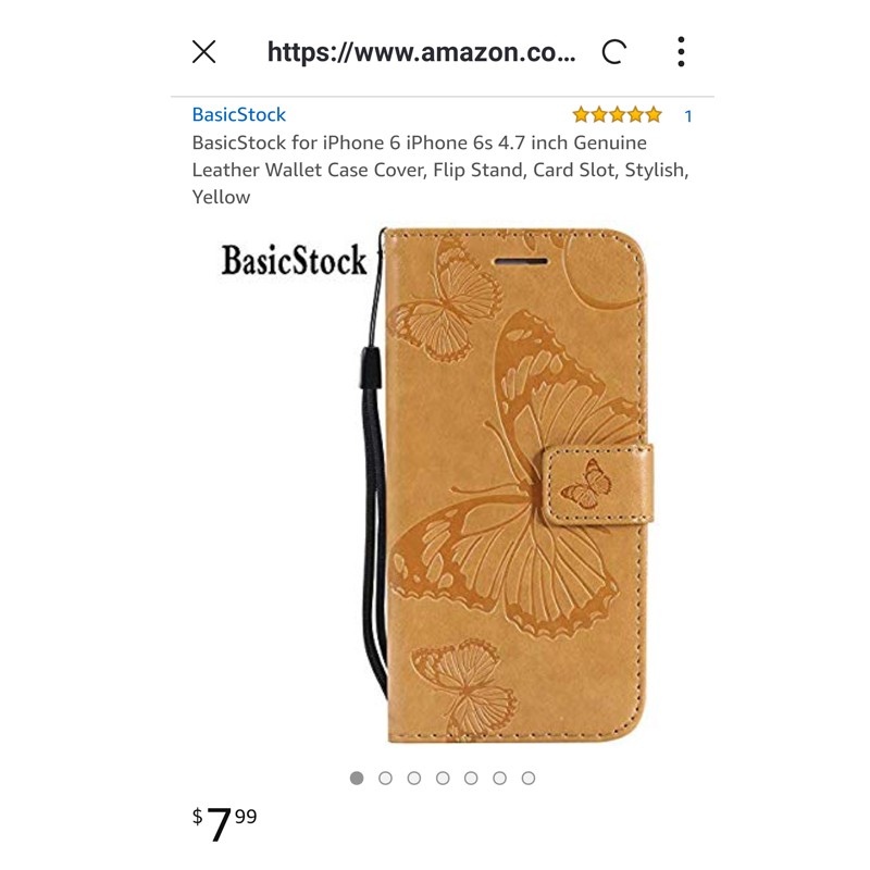
This is how your title should be:
Main Keyword (Pack of or dimensions, quantity or other important information) + One Unique Benefit That Differentiates Your Product from Competitors + Synonym Keywords + Other Benefits + Brand Name
General Guidelines:
Capitalize the first letter of each word (except conjunctions)
Avoid all caps and symbols such as exclamation mark or dollar sign
Stay away from promotional words like “on sale”, “bestseller” or “free shipping”
Important information like packaging and quantity should be at the front
Spell out the measurements. E.g., 6 inches instead of 6”
Make the title readable. If the title feels unnatural while reading, the customer will scroll down right away
Use commas and dash to break up sentences
Step #2 Optimize Your Hero Image:
Just like the desktop version, images are the first thing buyers will see in your listing. But unlike desktop, buyers will be able to see only the hero image; as thumbnails are not visible, they will have to scroll through to view other images. The first impression counts so make sure you have an amazing main image which captures buyer’s attention. As the default orientation of mobile phones is a portrait, the mobile apps will favor images with longer proportions than those with wider proportions. Plus in mobiles, the images will appear much smaller compared to the desktop, so it is essential to have high definition images that are not pixelated.
Only the first 7 images will be displayed on the product page, no matter how many a seller uploads. While a customer can open and view all 9 images in desktop, there is no possibility to view the last two images on mobile. So set the order of your image accordingly.
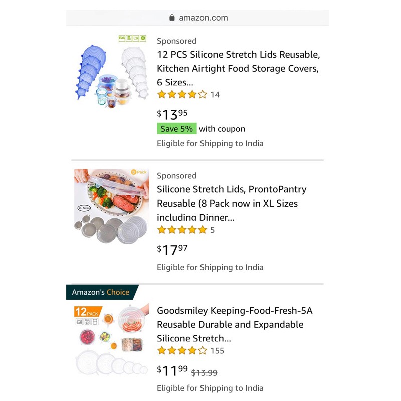
General guidelines:
Images should 1000 x 1000 pixels for zooming capability
Product should fill 80% of the image
Highlight the benefits and features through infographics
Keep the satisfaction guaranteed image in the last
To know more about the images Amazon sellers must have in their listing, click on the link below: https://www.estorefactory.com/blog/6-types-of-product-images-every-amazon-seller-must-have/
Step #3 Capitalize On The First Three Bullet Points:
List the copy with concise bullet points that focus on the product’s benefits for users rather than just listing out the complicated features and heavy technical information. For example, writing EASY TO CLEAN will be more appropriate rather than writing DISHWASHER SAFE. Capitalize words at the beginning of each bullet point so the user can easily identify the key selling points, the rest of the part is for A9. Avoid duplicating the text in your description and bullet points section. Bullet points should be no longer than 200 characters; otherwise, they will look too hard to read and bulky. Make sure that any copy you include adds value to your listing.
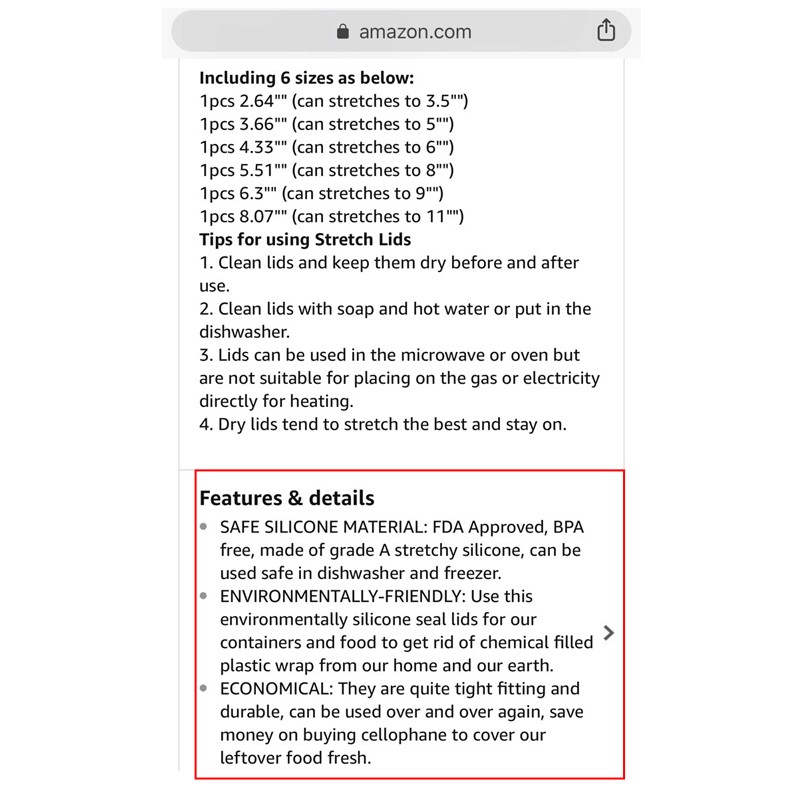
General guidelines:
Make the headers of each bullet point capital
Put the most important points first
Focus on benefits and not features
Focus on resolving the pain points
Language should be brief, punchy and hard hitting
Include a call to action in the 3rd bullet point
Step #4 Cut The Fluff From The Description:
You have already described the features in the bullet points, so reserve this section for storytelling about the product and brand as well as to explain to the users what sets your product apart from others in its category. To make the description skimmable and easy to follow, break up the lengthy paragraphs with space. Only the first 200 characters of the description will reflect. Include the most compelling information first so the user will click to see the rest. Another important thing sellers must take note of is that all the information of the description will be crammed into one paragraph. Buyers won’t be able to see the formatting unless and until they actually click and expand the description field.
General guidelines:
Focus on the first 200 characters
Too long paragraphs will turn off the buyer’s interest. So break the paragraphs into small readable sections
Language should be conversational. Example: Tired of cleaning the grill grates with flimsy plastic brushes? Make cleanup hassle-free, convenient and quick with OXB BBQ Grill Brush!
Use bold formatting to highlight the key aspects
Prioritize the description layout wisely
Step #5 Make The Most of Video Shorts:
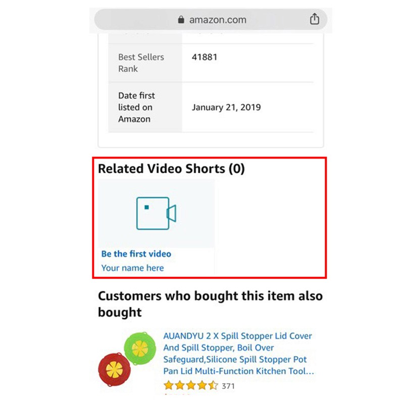
If a seller has uploaded a video on their product listing, then it will be hidden among other product images. The hope is that the customer will swipe left through the images and get through the end to view the video.
One plus point is Amazon Video Shorts: https://www.amazon.com/Video-Shorts/b?ie=UTF8&node=9013971011. They appear right below the product description and features. Adding video is becoming more and more popular day by day and brands should think about a video dedicated to explain the features of their product.
Step #6 Implement Digestible Enhanced Brand Content
Available to all sellers who have Amazon Brand Registry, Enhanced Brand Content is a great converting tool that will enhance the look of your product detail page and answer the most commonly asked customer questions. The good news is that EBC is displayed exceptionally well on mobile. Shoppers will not have to click through like description and features to view EBC. By implementing EBC in your product detail page, shoppers can see everything from title, description and enticing graphics without having to click through.General guidelines:
Don’t go too heavy on the text as it will be difficult to view on mobile
Make clean and neat images that are effective
Use Amazon modules to make the EBC more readable, scannable and user-friendly
Final Thoughts:
If done right, mobile optimization can be a key advantage that can give you an edge over your competitors. Besides, mobile experience won’t go anywhere; it will just get bigger day by day. Strive for a clear, crisp and to the point copy and remove anything that does not convey your product features, brand message and keywords. If you are struggling to optimize your Amazon listing for mobile, contact us. Our Amazon Product Listing Optimization experts will work with you to tailor your listing for mobile apps.
It won’t be an exaggeration to say that mobile is not the future of ecommerce, it is the present. According to research released by the CTA, almost two-third of US customers use mobile to shop. In the Amazon marketplace, the number is most likely to go higher. During the holiday season, 70% of the customers shop via mobile devices. So the bottom line is that optimizing the mobile experience should be the number one priority for every Amazon seller. What usually happens is that brands look at the listing on their desktop and forget that mobile shopping is poles apart from desktop shopping.
How Will Your Listing Look On Mobile vs Desktop?
In the mobile version, the placement and look of the four key parts of your listing will change:
Product title
Bullet points
Product description
Product images
Below, we have listed out the significant changes that will take place on your product detail page:
The user will be able to see the images first and then the text
Only the first 80 characters of the title will be visible
The sponsored tag is less noticeable than the desktop version, so it will be hard to differentiate between sponsored and organic results
The description will show the above bullet points
Only three bullet points will be visible at first after that buyer will have to click on the “>” icon
Only the first 200 characters of the description are shown, to read the rest buyer will have to click on the “>” icon
Just after the images, similar product offers will be shown on Amazon
How to Optimize For Mobile?
Step #1 Tune Your Product Title:
This is the first textual information the buyer will read. On mobile apps, only the first 80 characters of the title would show up. So it is critical that you add high-frequency keywords as well as a standout feature in the first part. This will make your title different in the search result and increase the Click Through Rate (CTR). While using descriptive terms, carefully consider which one to prioritize, so buyers do not miss any important information while scrolling down. Just by glancing once, the buyer should be able to identify what is the product and why is it good. If the brand name is not famous, it is better to add it at last. You cannot ignore the fact that “by ABC” is mentioned right under the shortened title, so it’s better not to waste your precious characters in writing the brand name first.

This is how your title should be:
Main Keyword (Pack of or dimensions, quantity or other important information) + One Unique Benefit That Differentiates Your Product from Competitors + Synonym Keywords + Other Benefits + Brand Name
General Guidelines:
Capitalize the first letter of each word (except conjunctions)
Avoid all caps and symbols such as exclamation mark or dollar sign
Stay away from promotional words like “on sale”, “bestseller” or “free shipping”
Important information like packaging and quantity should be at the front
Spell out the measurements. E.g., 6 inches instead of 6”
Make the title readable. If the title feels unnatural while reading, the customer will scroll down right away
Use commas and dash to break up sentences
Step #2 Optimize Your Hero Image:
Just like the desktop version, images are the first thing buyers will see in your listing. But unlike desktop, buyers will be able to see only the hero image; as thumbnails are not visible, they will have to scroll through to view other images. The first impression counts so make sure you have an amazing main image which captures buyer’s attention. As the default orientation of mobile phones is a portrait, the mobile apps will favor images with longer proportions than those with wider proportions. Plus in mobiles, the images will appear much smaller compared to the desktop, so it is essential to have high definition images that are not pixelated.
Only the first 7 images will be displayed on the product page, no matter how many a seller uploads. While a customer can open and view all 9 images in desktop, there is no possibility to view the last two images on mobile. So set the order of your image accordingly.

General guidelines:
Images should 1000 x 1000 pixels for zooming capability
Product should fill 80% of the image
Highlight the benefits and features through infographics
Keep the satisfaction guaranteed image in the last
To know more about the images Amazon sellers must have in their listing, click on the link below: https://www.estorefactory.com/blog/6-types-of-product-images-every-amazon-seller-must-have/
Step #3 Capitalize On The First Three Bullet Points:
List the copy with concise bullet points that focus on the product’s benefits for users rather than just listing out the complicated features and heavy technical information. For example, writing EASY TO CLEAN will be more appropriate rather than writing DISHWASHER SAFE. Capitalize words at the beginning of each bullet point so the user can easily identify the key selling points, the rest of the part is for A9. Avoid duplicating the text in your description and bullet points section. Bullet points should be no longer than 200 characters; otherwise, they will look too hard to read and bulky. Make sure that any copy you include adds value to your listing.

General guidelines:
Make the headers of each bullet point capital
Put the most important points first
Focus on benefits and not features
Focus on resolving the pain points
Language should be brief, punchy and hard hitting
Include a call to action in the 3rd bullet point
Step #4 Cut The Fluff From The Description:
You have already described the features in the bullet points, so reserve this section for storytelling about the product and brand as well as to explain to the users what sets your product apart from others in its category. To make the description skimmable and easy to follow, break up the lengthy paragraphs with space. Only the first 200 characters of the description will reflect. Include the most compelling information first so the user will click to see the rest. Another important thing sellers must take note of is that all the information of the description will be crammed into one paragraph. Buyers won’t be able to see the formatting unless and until they actually click and expand the description field.
General guidelines:
Focus on the first 200 characters
Too long paragraphs will turn off the buyer’s interest. So break the paragraphs into small readable sections
Language should be conversational. Example: Tired of cleaning the grill grates with flimsy plastic brushes? Make cleanup hassle-free, convenient and quick with OXB BBQ Grill Brush!
Use bold formatting to highlight the key aspects
Prioritize the description layout wisely
Step #5 Make The Most of Video Shorts:
If a seller has uploaded a video on their product listing, then it will be hidden among other product images. The hope is that the customer will swipe left through the images and get through the end to view the video.
One plus point is Amazon Video Shorts: https://www.amazon.com/Video-Shorts/b?ie=UTF8&node=9013971011. They appear right below the product description and features. Adding video is becoming more and more popular day by day and brands should think about a video dedicated to explain the features of their product.

Step #6 Implement Digestible Enhanced Brand Content
Available to all sellers who have Amazon Brand Registry, Enhanced Brand Content is a great converting tool that will enhance the look of your product detail page and answer the most commonly asked customer questions. The good news is that EBC is displayed exceptionally well on mobile. Shoppers will not have to click through like description and features to view EBC. By implementing EBC in your product detail page, shoppers can see everything from title, description and enticing graphics without having to click through.General guidelines:
Don’t go too heavy on the text as it will be difficult to view on mobile
Make clean and neat images that are effective
Use Amazon modules to make the EBC more readable, scannable and user-friendly
Final Thoughts:
If done right, mobile optimization can be a key advantage that can give you an edge over your competitors. Besides, mobile experience won’t go anywhere; it will just get bigger day by day. Strive for a clear, crisp and to the point copy and remove anything that does not convey your product features, brand message and keywords. If you are struggling to optimize your Amazon listing for mobile, contact us. Our Amazon Product Listing Optimization experts will work with you to tailor your listing for mobile apps.
It won’t be an exaggeration to say that mobile is not the future of ecommerce, it is the present. According to research released by the CTA, almost two-third of US customers use mobile to shop. In the Amazon marketplace, the number is most likely to go higher. During the holiday season, 70% of the customers shop via mobile devices. So the bottom line is that optimizing the mobile experience should be the number one priority for every Amazon seller. What usually happens is that brands look at the listing on their desktop and forget that mobile shopping is poles apart from desktop shopping.
How Will Your Listing Look On Mobile vs Desktop?
In the mobile version, the placement and look of the four key parts of your listing will change:
Product title
Bullet points
Product description
Product images
Below, we have listed out the significant changes that will take place on your product detail page:
The user will be able to see the images first and then the text
Only the first 80 characters of the title will be visible
The sponsored tag is less noticeable than the desktop version, so it will be hard to differentiate between sponsored and organic results
The description will show the above bullet points
Only three bullet points will be visible at first after that buyer will have to click on the “>” icon
Only the first 200 characters of the description are shown, to read the rest buyer will have to click on the “>” icon
Just after the images, similar product offers will be shown on Amazon
How to Optimize For Mobile?
Step #1 Tune Your Product Title:
This is the first textual information the buyer will read. On mobile apps, only the first 80 characters of the title would show up. So it is critical that you add high-frequency keywords as well as a standout feature in the first part. This will make your title different in the search result and increase the Click Through Rate (CTR). While using descriptive terms, carefully consider which one to prioritize, so buyers do not miss any important information while scrolling down. Just by glancing once, the buyer should be able to identify what is the product and why is it good. If the brand name is not famous, it is better to add it at last. You cannot ignore the fact that “by ABC” is mentioned right under the shortened title, so it’s better not to waste your precious characters in writing the brand name first.

This is how your title should be:
Main Keyword (Pack of or dimensions, quantity or other important information) + One Unique Benefit That Differentiates Your Product from Competitors + Synonym Keywords + Other Benefits + Brand Name
General Guidelines:
Capitalize the first letter of each word (except conjunctions)
Avoid all caps and symbols such as exclamation mark or dollar sign
Stay away from promotional words like “on sale”, “bestseller” or “free shipping”
Important information like packaging and quantity should be at the front
Spell out the measurements. E.g., 6 inches instead of 6”
Make the title readable. If the title feels unnatural while reading, the customer will scroll down right away
Use commas and dash to break up sentences
Step #2 Optimize Your Hero Image:
Just like the desktop version, images are the first thing buyers will see in your listing. But unlike desktop, buyers will be able to see only the hero image; as thumbnails are not visible, they will have to scroll through to view other images. The first impression counts so make sure you have an amazing main image which captures buyer’s attention. As the default orientation of mobile phones is a portrait, the mobile apps will favor images with longer proportions than those with wider proportions. Plus in mobiles, the images will appear much smaller compared to the desktop, so it is essential to have high definition images that are not pixelated.
Only the first 7 images will be displayed on the product page, no matter how many a seller uploads. While a customer can open and view all 9 images in desktop, there is no possibility to view the last two images on mobile. So set the order of your image accordingly.

General guidelines:
Images should 1000 x 1000 pixels for zooming capability
Product should fill 80% of the image
Highlight the benefits and features through infographics
Keep the satisfaction guaranteed image in the last
To know more about the images Amazon sellers must have in their listing, click on the link below: https://www.estorefactory.com/blog/6-types-of-product-images-every-amazon-seller-must-have/
Step #3 Capitalize On The First Three Bullet Points:
List the copy with concise bullet points that focus on the product’s benefits for users rather than just listing out the complicated features and heavy technical information. For example, writing EASY TO CLEAN will be more appropriate rather than writing DISHWASHER SAFE. Capitalize words at the beginning of each bullet point so the user can easily identify the key selling points, the rest of the part is for A9. Avoid duplicating the text in your description and bullet points section. Bullet points should be no longer than 200 characters; otherwise, they will look too hard to read and bulky. Make sure that any copy you include adds value to your listing.

General guidelines:
Make the headers of each bullet point capital
Put the most important points first
Focus on benefits and not features
Focus on resolving the pain points
Language should be brief, punchy and hard hitting
Include a call to action in the 3rd bullet point
Step #4 Cut The Fluff From The Description:
You have already described the features in the bullet points, so reserve this section for storytelling about the product and brand as well as to explain to the users what sets your product apart from others in its category. To make the description skimmable and easy to follow, break up the lengthy paragraphs with space. Only the first 200 characters of the description will reflect. Include the most compelling information first so the user will click to see the rest. Another important thing sellers must take note of is that all the information of the description will be crammed into one paragraph. Buyers won’t be able to see the formatting unless and until they actually click and expand the description field.
General guidelines:
Focus on the first 200 characters
Too long paragraphs will turn off the buyer’s interest. So break the paragraphs into small readable sections
Language should be conversational. Example: Tired of cleaning the grill grates with flimsy plastic brushes? Make cleanup hassle-free, convenient and quick with OXB BBQ Grill Brush!
Use bold formatting to highlight the key aspects
Prioritize the description layout wisely
Step #5 Make The Most of Video Shorts:
If a seller has uploaded a video on their product listing, then it will be hidden among other product images. The hope is that the customer will swipe left through the images and get through the end to view the video.
One plus point is Amazon Video Shorts: https://www.amazon.com/Video-Shorts/b?ie=UTF8&node=9013971011. They appear right below the product description and features. Adding video is becoming more and more popular day by day and brands should think about a video dedicated to explain the features of their product.

Step #6 Implement Digestible Enhanced Brand Content
Available to all sellers who have Amazon Brand Registry, Enhanced Brand Content is a great converting tool that will enhance the look of your product detail page and answer the most commonly asked customer questions. The good news is that EBC is displayed exceptionally well on mobile. Shoppers will not have to click through like description and features to view EBC. By implementing EBC in your product detail page, shoppers can see everything from title, description and enticing graphics without having to click through.General guidelines:
Don’t go too heavy on the text as it will be difficult to view on mobile
Make clean and neat images that are effective
Use Amazon modules to make the EBC more readable, scannable and user-friendly
Final Thoughts:
If done right, mobile optimization can be a key advantage that can give you an edge over your competitors. Besides, mobile experience won’t go anywhere; it will just get bigger day by day. Strive for a clear, crisp and to the point copy and remove anything that does not convey your product features, brand message and keywords. If you are struggling to optimize your Amazon listing for mobile, contact us. Our Amazon Product Listing Optimization experts will work with you to tailor your listing for mobile apps.


