Back to Page
Amazon A+ Content
How To Create Converting A+ Pages
How To Create Converting A+ Pages


Back to Page
Amazon A+ Content
How To Create Converting A+ Pages

Episode 3: A+ Pages
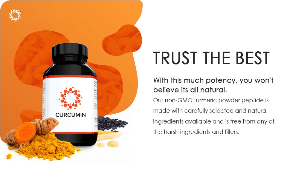
Winning Amazon sales is all about differentiating your product – especially when you are competing directly with 300,000 other U.S. marketplace sellers. A+ Pages (previously known as Enhanced Brand Content) gives you a nudge in the right direction. If done right, it can be a potent factor in increasing your conversion rates. In this article, we learn a simple yet effective formula that can help you create converting A+ Pages. But before that, let me answer the most common question sellers have while creating an A+ Page: Will shoppers view my A+ page?
Despite Being Below The Folds, EVERY Shopper Is Going To View Your A+ Page
EBC does not have a prominent position, yet it is located before the reviews and customer question and answers section. A buyer might skip the description and sometimes choose not to see the images first, but they would never risk missing to review the reviews. It’s like a prerequisite before making a purchase decision. When they are scrolling down to read the reviews, a well-made EBC can instantly catch their attention and interest them to know more and more about the product. If your EBC can win the shopper’s heart and build trust, a small number of negative reviews won’t even affect them!
The Tried & Tested Formula To Create Converting A+ Pages

Sometimes the most challenging problems have the simplest solutions. And the situation is no different with creating A+ Pages. The method to create a successful A+ Page is all about following the three principles: Inspire, Inform & Convert. These are the only three things your EBC needs to do. Inspire means to evoke a desire in the minds of customers that they need to have this product in their homes. Inform means to educate them about the product features and the benefits. Lastly, they convert to sales by connecting with the brand. Your hero images work to inspire the shopper, the graphics, slideshow, image text modules and banner images help to educate (inform) them more about the product and the brand story helps them convert the visitors to shoppers.
5 Elements Of A Converting EBC
#1: Hero Image – To Stop Them From Scrolling
The purpose of the hero image is to arrest a shopper’s attention. When the customers are scrolling up and down the listing, you need something that can stop them from scrolling. Just like the hero image on the website interests the visitor to review the website further, the hero image of your A+ Page will keep the shoppers interested in what you have to offer. While they are hastily scanning your listing, they see a striking image that’s HUGE, the largest image on the entire page. This is what you want to start with. The hero image is just made so that your customers can stop for a second. In the example below, we have used a lifestyle image of a fit and active girl. By looking at the image, shoppers will start thinking, “Hey, she looks so fit, if I buy this product, that could be me!”. And this is when they will want to know more about your product.

#2: Graphic Banner – To Make Crucial Product Information Digestible
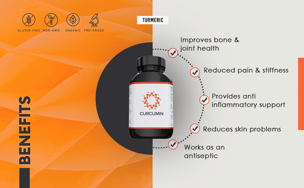
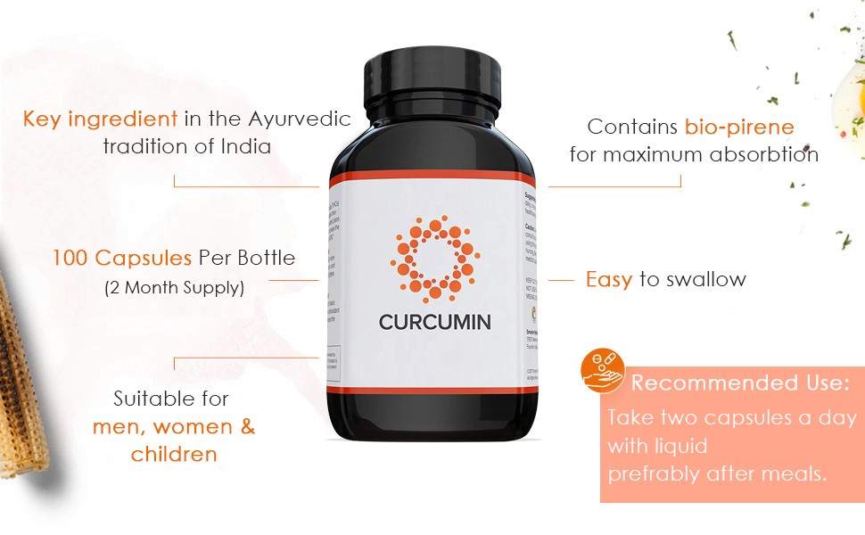
Your hero image has grabbed the attention, now you need to explain the features of the product which you wrote in your copy, but obviously, most of the shoppers decided not to read it. Create a visually appealing banner that showcases the standout features of the product and advertises them as the benefits, so it’s easy for the customers to know what’s in store for them. Here is the place to be creative. If you have one feature, that no other product has, dedicate this banner to highlight that single feature. Use as many icons and graphics as you can. In this part, the text takes the back seat, and graphics lead. These banners are a cool way to communicate your ideas without using text. Just crisp, one-liner taglines will do the thing.
#3: Slideshow Images - To Keep Them Engaged
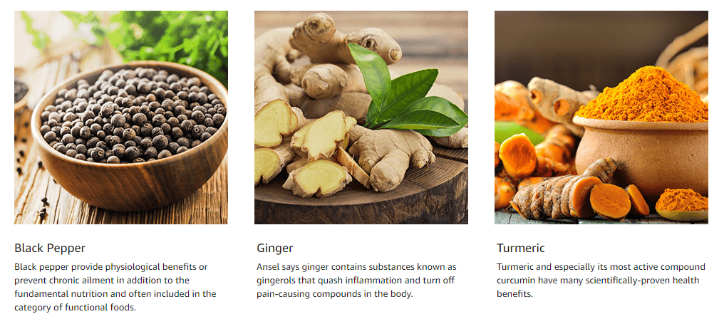
This is the only interactive and the most overlooked module of A+ Page. To view the images and read the text, customers will have to hover over the little squares. While shoppers are viewing the images on this module, they are subconsciously making a commitment because they are doing something to understand the product. No matter how small the commitment is, it takes them a step nearer to the coveted Add To Cart button. This module also saves a lot of space, so you have the opportunity to place four images and four text paragraphs in a small amount of space. You can convey all the information in easy-to-read bullet format without making the EBC too lengthy and bulky.

#4: Story & Ethics – To Seal The Deal
Telling a brand story isn’t just important; it’s critical. Your shoppers were patient enough to go this far on your A+ Page and at this moment, they are craving for a reason to connect with you on an emotional level. So give them that reason. Wrap your brand message into a story that transports people and provokes an emotional response. Till now, they were connected with their minds, but from this point, they will be able to connect with their hearts. This is also a great way to differentiate yourself from the Chinese suppliers who are going to compete on price. There is a huge chunk of shoppers that don’t mind paying extra for quality products and in this part of the EBC, you are targeting them. Justify why your product is expensive from other similar yet cheaply made versions and step out of the price game.
#5: Comparison Chart – To Cross-Sell Other Products From Your Catalog
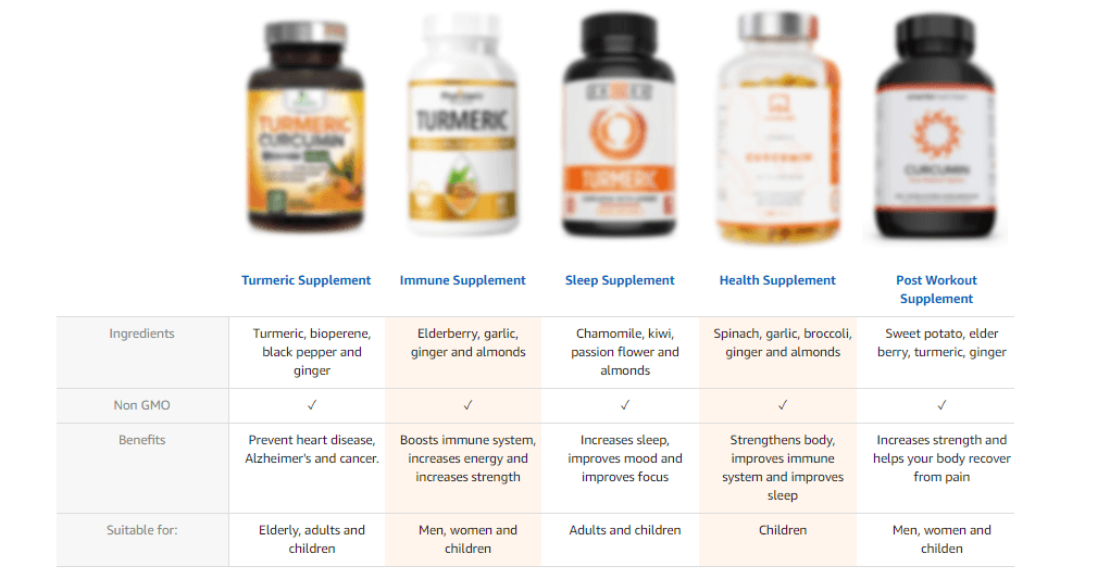
This part allows you to get more real estate on the listings. Not so surprisingly, Amazon makes every attempt to steal your customers from your listings, which you can see in the image below. There are sponsored products related to this item section, compared with the similar items section, 4 stars and above section, and two product display ads exactly below the add to cart button. The comparison chart is your chance to redirect the buyers to YOUR other listings because these links are clickable. This is a must-have for every A+ Page; you don’t want to overlook this module. Whether your product has size variation, color variation, or you have any other product in your catalog, just add them to the comparison chart and increase the chances of cross-selling.
Always Remember: A+ Page Is All About Images
The better your images are, the better your A+ Page will be. You need great images and designs that leave an impact on the minds of customers. Though Amazon may have advertised it as a DIY tool, it is not. Shoppers are very smart; they instantly identify the difference between a professional brand and an amateur seller. If you have unprofessional images, poor display of text, and irrelevant design and graphics, your customers will notice instantly. This will create a wrong impression and your conversion rates will suffer because of it. If you want to avoid all this, you can hire Amazon EBC experts from eStore Factory. With experience in creating more than 950 A+ Pages on Amazon, our Amazon A+ Content consultants can help you create an A+ Page that can skyrocket your conversion rates.
Learn Everything About Increasing Conversion Rates In This Series
On popular demand, I am thrilled to write a blog series on increasing conversion rates. So many of you told me to write a blog on this topic, but covering every minute detail in one post was not possible, so I decided to make a series out of it. It’s a four-episode series and in each episode, we will take a more in-depth look at the elements that can help you optimize your conversion rates (Images, Reviews, Copy, A+ Page). In the next and final episode of the series, we will learn everything about reviews, the most important element affecting conversion rates. Till then, stay tuned, and happy selling! Also, let me know if you want me to cover any other topics :)
Episode 3: A+ Pages
Winning Amazon sales is all about differentiating your product – especially when you are competing directly with 300,000 other U.S. marketplace sellers. A+ Pages (previously known as Enhanced Brand Content) gives you a nudge in the right direction. If done right, it can be a potent factor in increasing your conversion rates. In this article, we learn a simple yet effective formula that can help you create converting A+ Pages. But before that, let me answer the most common question sellers have while creating an A+ Page: Will shoppers view my A+ page?
Despite Being Below The Folds, EVERY Shopper Is Going To View Your A+ Page
EBC does not have a prominent position, yet it is located before the reviews and customer question and answers section. A buyer might skip the description and sometimes choose not to see the images first, but they would never risk missing to review the reviews. It’s like a prerequisite before making a purchase decision. When they are scrolling down to read the reviews, a well-made EBC can instantly catch their attention and interest them to know more and more about the product. If your EBC can win the shopper’s heart and build trust, a small number of negative reviews won’t even affect them!
The Tried & Tested Formula To Create Converting A+ Pages

Sometimes the most challenging problems have the simplest solutions. And the situation is no different with creating A+ Pages. The method to create a successful A+ Page is all about following the three principles: Inspire, Inform & Convert. These are the only three things your EBC needs to do. Inspire means to evoke a desire in the minds of customers that they need to have this product in their homes. Inform means to educate them about the product features and the benefits. Lastly, they convert to sales by connecting with the brand. Your hero images work to inspire the shopper, the graphics, slideshow, image text modules and banner images help to educate (inform) them more about the product and the brand story helps them convert the visitors to shoppers.
5 Elements Of A Converting EBC
#1: Hero Image – To Stop Them From Scrolling
The purpose of the hero image is to arrest a shopper’s attention. When the customers are scrolling up and down the listing, you need something that can stop them from scrolling. Just like the hero image on the website interests the visitor to review the website further, the hero image of your A+ Page will keep the shoppers interested in what you have to offer. While they are hastily scanning your listing, they see a striking image that’s HUGE, the largest image on the entire page. This is what you want to start with. The hero image is just made so that your customers can stop for a second. In the example below, we have used a lifestyle image of a fit and active girl. By looking at the image, shoppers will start thinking, “Hey, she looks so fit, if I buy this product, that could be me!”. And this is when they will want to know more about your product.

#2: Graphic Banner – To Make Crucial Product Information Digestible
Your hero image has grabbed the attention, now you need to explain the features of the product which you wrote in your copy, but obviously, most of the shoppers decided not to read it. Create a visually appealing banner that showcases the standout features of the product and advertises them as the benefits, so it’s easy for the customers to know what’s in store for them. Here is the place to be creative. If you have one feature, that no other product has, dedicate this banner to highlight that single feature. Use as many icons and graphics as you can. In this part, the text takes the back seat, and graphics lead. These banners are a cool way to communicate your ideas without using text. Just crisp, one-liner taglines will do the thing.


#3: Slideshow Images - To Keep Them Engaged
This is the only interactive and the most overlooked module of A+ Page. To view the images and read the text, customers will have to hover over the little squares. While shoppers are viewing the images on this module, they are subconsciously making a commitment because they are doing something to understand the product. No matter how small the commitment is, it takes them a step nearer to the coveted Add To Cart button. This module also saves a lot of space, so you have the opportunity to place four images and four text paragraphs in a small amount of space. You can convey all the information in easy-to-read bullet format without making the EBC too lengthy and bulky.


#4: Story & Ethics – To Seal The Deal
Telling a brand story isn’t just important; it’s critical. Your shoppers were patient enough to go this far on your A+ Page and at this moment, they are craving for a reason to connect with you on an emotional level. So give them that reason. Wrap your brand message into a story that transports people and provokes an emotional response. Till now, they were connected with their minds, but from this point, they will be able to connect with their hearts. This is also a great way to differentiate yourself from the Chinese suppliers who are going to compete on price. There is a huge chunk of shoppers that don’t mind paying extra for quality products and in this part of the EBC, you are targeting them. Justify why your product is expensive from other similar yet cheaply made versions and step out of the price game.

#5: Comparison Chart – To Cross-Sell Other Products From Your Catalog
This part allows you to get more real estate on the listings. Not so surprisingly, Amazon makes every attempt to steal your customers from your listings, which you can see in the image below. There are sponsored products related to this item section, compared with the similar items section, 4 stars and above section, and two product display ads exactly below the add to cart button. The comparison chart is your chance to redirect the buyers to YOUR other listings because these links are clickable. This is a must-have for every A+ Page; you don’t want to overlook this module. Whether your product has size variation, color variation, or you have any other product in your catalog, just add them to the comparison chart and increase the chances of cross-selling.

Always Remember: A+ Page Is All About Images
The better your images are, the better your A+ Page will be. You need great images and designs that leave an impact on the minds of customers. Though Amazon may have advertised it as a DIY tool, it is not. Shoppers are very smart; they instantly identify the difference between a professional brand and an amateur seller. If you have unprofessional images, poor display of text, and irrelevant design and graphics, your customers will notice instantly. This will create a wrong impression and your conversion rates will suffer because of it. If you want to avoid all this, you can hire Amazon EBC experts from eStore Factory. With experience in creating more than 950 A+ Pages on Amazon, our Amazon A+ Content consultants can help you create an A+ Page that can skyrocket your conversion rates.
Learn Everything About Increasing Conversion Rates In This Series
On popular demand, I am thrilled to write a blog series on increasing conversion rates. So many of you told me to write a blog on this topic, but covering every minute detail in one post was not possible, so I decided to make a series out of it. It’s a four-episode series and in each episode, we will take a more in-depth look at the elements that can help you optimize your conversion rates (Images, Reviews, Copy, A+ Page). In the next and final episode of the series, we will learn everything about reviews, the most important element affecting conversion rates. Till then, stay tuned, and happy selling! Also, let me know if you want me to cover any other topics :)
Episode 3: A+ Pages
Winning Amazon sales is all about differentiating your product – especially when you are competing directly with 300,000 other U.S. marketplace sellers. A+ Pages (previously known as Enhanced Brand Content) gives you a nudge in the right direction. If done right, it can be a potent factor in increasing your conversion rates. In this article, we learn a simple yet effective formula that can help you create converting A+ Pages. But before that, let me answer the most common question sellers have while creating an A+ Page: Will shoppers view my A+ page?
Despite Being Below The Folds, EVERY Shopper Is Going To View Your A+ Page
EBC does not have a prominent position, yet it is located before the reviews and customer question and answers section. A buyer might skip the description and sometimes choose not to see the images first, but they would never risk missing to review the reviews. It’s like a prerequisite before making a purchase decision. When they are scrolling down to read the reviews, a well-made EBC can instantly catch their attention and interest them to know more and more about the product. If your EBC can win the shopper’s heart and build trust, a small number of negative reviews won’t even affect them!
The Tried & Tested Formula To Create Converting A+ Pages

Sometimes the most challenging problems have the simplest solutions. And the situation is no different with creating A+ Pages. The method to create a successful A+ Page is all about following the three principles: Inspire, Inform & Convert. These are the only three things your EBC needs to do. Inspire means to evoke a desire in the minds of customers that they need to have this product in their homes. Inform means to educate them about the product features and the benefits. Lastly, they convert to sales by connecting with the brand. Your hero images work to inspire the shopper, the graphics, slideshow, image text modules and banner images help to educate (inform) them more about the product and the brand story helps them convert the visitors to shoppers.
5 Elements Of A Converting EBC
#1: Hero Image – To Stop Them From Scrolling
The purpose of the hero image is to arrest a shopper’s attention. When the customers are scrolling up and down the listing, you need something that can stop them from scrolling. Just like the hero image on the website interests the visitor to review the website further, the hero image of your A+ Page will keep the shoppers interested in what you have to offer. While they are hastily scanning your listing, they see a striking image that’s HUGE, the largest image on the entire page. This is what you want to start with. The hero image is just made so that your customers can stop for a second. In the example below, we have used a lifestyle image of a fit and active girl. By looking at the image, shoppers will start thinking, “Hey, she looks so fit, if I buy this product, that could be me!”. And this is when they will want to know more about your product.

#2: Graphic Banner – To Make Crucial Product Information Digestible
Your hero image has grabbed the attention, now you need to explain the features of the product which you wrote in your copy, but obviously, most of the shoppers decided not to read it. Create a visually appealing banner that showcases the standout features of the product and advertises them as the benefits, so it’s easy for the customers to know what’s in store for them. Here is the place to be creative. If you have one feature, that no other product has, dedicate this banner to highlight that single feature. Use as many icons and graphics as you can. In this part, the text takes the back seat, and graphics lead. These banners are a cool way to communicate your ideas without using text. Just crisp, one-liner taglines will do the thing.


#3: Slideshow Images - To Keep Them Engaged
This is the only interactive and the most overlooked module of A+ Page. To view the images and read the text, customers will have to hover over the little squares. While shoppers are viewing the images on this module, they are subconsciously making a commitment because they are doing something to understand the product. No matter how small the commitment is, it takes them a step nearer to the coveted Add To Cart button. This module also saves a lot of space, so you have the opportunity to place four images and four text paragraphs in a small amount of space. You can convey all the information in easy-to-read bullet format without making the EBC too lengthy and bulky.


#4: Story & Ethics – To Seal The Deal
Telling a brand story isn’t just important; it’s critical. Your shoppers were patient enough to go this far on your A+ Page and at this moment, they are craving for a reason to connect with you on an emotional level. So give them that reason. Wrap your brand message into a story that transports people and provokes an emotional response. Till now, they were connected with their minds, but from this point, they will be able to connect with their hearts. This is also a great way to differentiate yourself from the Chinese suppliers who are going to compete on price. There is a huge chunk of shoppers that don’t mind paying extra for quality products and in this part of the EBC, you are targeting them. Justify why your product is expensive from other similar yet cheaply made versions and step out of the price game.

#5: Comparison Chart – To Cross-Sell Other Products From Your Catalog
This part allows you to get more real estate on the listings. Not so surprisingly, Amazon makes every attempt to steal your customers from your listings, which you can see in the image below. There are sponsored products related to this item section, compared with the similar items section, 4 stars and above section, and two product display ads exactly below the add to cart button. The comparison chart is your chance to redirect the buyers to YOUR other listings because these links are clickable. This is a must-have for every A+ Page; you don’t want to overlook this module. Whether your product has size variation, color variation, or you have any other product in your catalog, just add them to the comparison chart and increase the chances of cross-selling.

Always Remember: A+ Page Is All About Images
The better your images are, the better your A+ Page will be. You need great images and designs that leave an impact on the minds of customers. Though Amazon may have advertised it as a DIY tool, it is not. Shoppers are very smart; they instantly identify the difference between a professional brand and an amateur seller. If you have unprofessional images, poor display of text, and irrelevant design and graphics, your customers will notice instantly. This will create a wrong impression and your conversion rates will suffer because of it. If you want to avoid all this, you can hire Amazon EBC experts from eStore Factory. With experience in creating more than 950 A+ Pages on Amazon, our Amazon A+ Content consultants can help you create an A+ Page that can skyrocket your conversion rates.
Learn Everything About Increasing Conversion Rates In This Series
On popular demand, I am thrilled to write a blog series on increasing conversion rates. So many of you told me to write a blog on this topic, but covering every minute detail in one post was not possible, so I decided to make a series out of it. It’s a four-episode series and in each episode, we will take a more in-depth look at the elements that can help you optimize your conversion rates (Images, Reviews, Copy, A+ Page). In the next and final episode of the series, we will learn everything about reviews, the most important element affecting conversion rates. Till then, stay tuned, and happy selling! Also, let me know if you want me to cover any other topics :)


